
Camden's House
Camden's House
Year:
Year:
2026
Deliverables:
Deliverables:
Brand Strategy
Brand Strategy
Visual Identity
Creative Direction
Marketing Collateral
Industry:
Industry:
Wellness | Health & Recovery
Location:
Location:
Aberdeen, Scotland
Before
Camden's House is a premium recovery and wellness space in Aberdeen, Scotland. First in Scotland to offer red light therapy, PEMF and lymphatic drainage under one roof — but the brand was communicating none of it with confidence or clarity.
The brief asked for a rebrand. The audit revealed something more specific was needed. Camden's House had something genuinely rare. The brand just wasn't saying so.
This project was developed from a public brief for a real client rebrand concept.
PROCESS
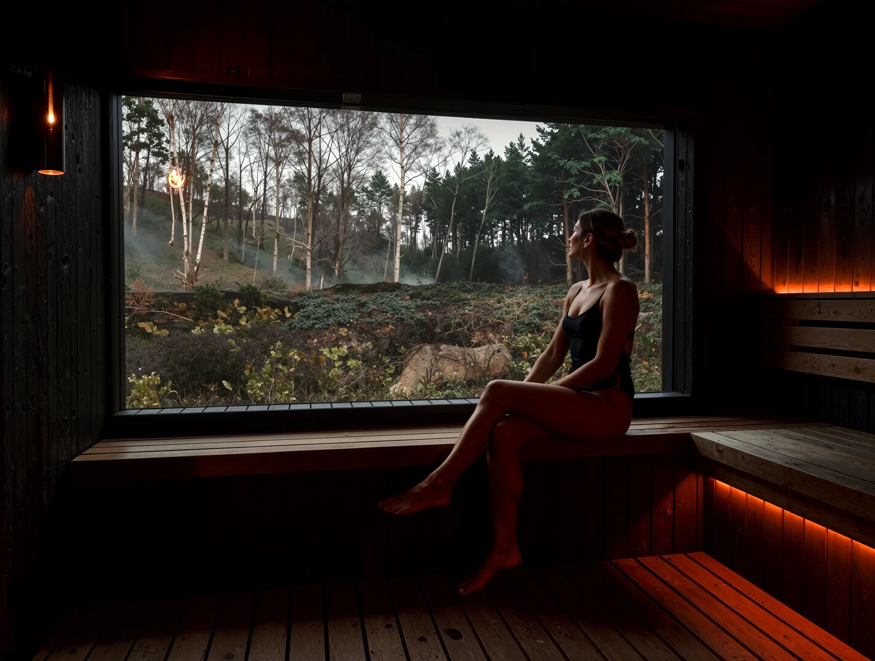
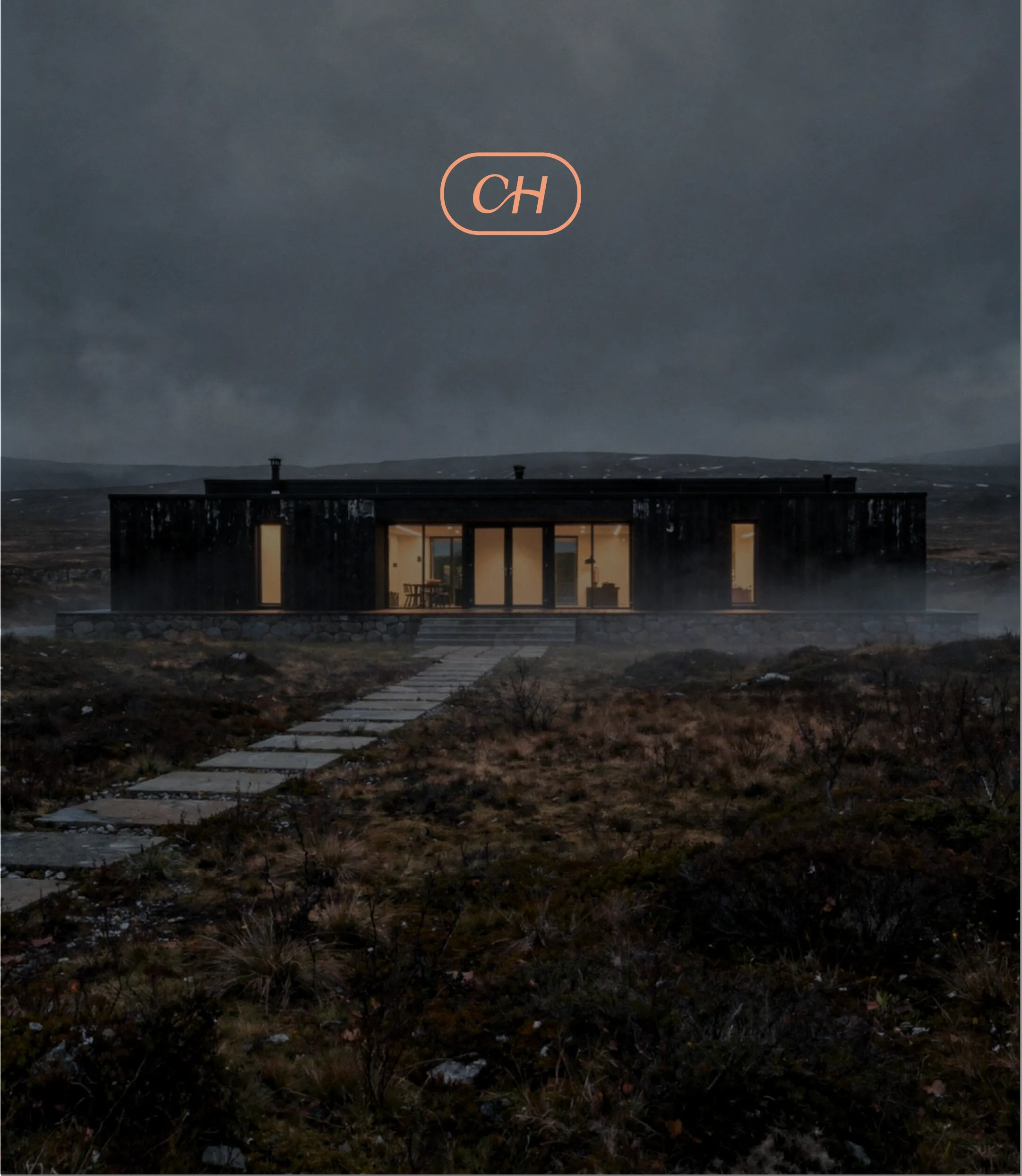
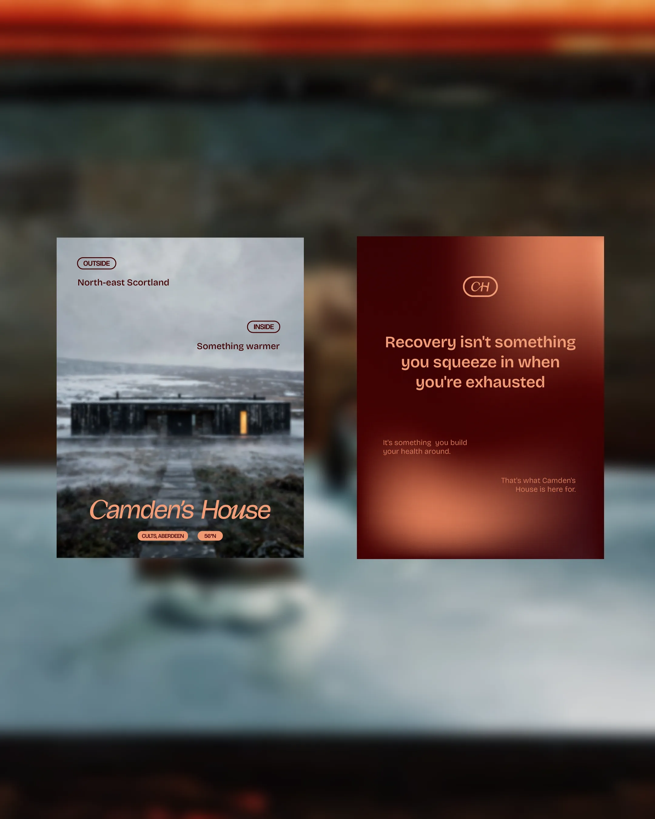
The audit identified the real opportunity: the North-East Scotland location wasn't backdrop, it was asset. The elemental harshness of that landscape, paired with the warmth of what happens inside — red light, heat, recovery — was a tension worth building an entire identity around.
That contrast of cold and warm, raw and restorative, exposed and protected is not decorative. It is the identity.
The strategy anchored everything: recovery leads, longevity supports, performance enriches. The target audience was the sceptical, time-poor professional, someone who needed to be understood before they'd be informed.
The messaging rule followed: outcome and feeling leads, science supports, education goes deep.
The tagline came from that logic. Hard science. Real recovery.
Four words that qualify the audience as much as they describe the brand.
The science had existed for decades. The access, in Aberdeen, was new.
The brand just needed to say that like it meant it.
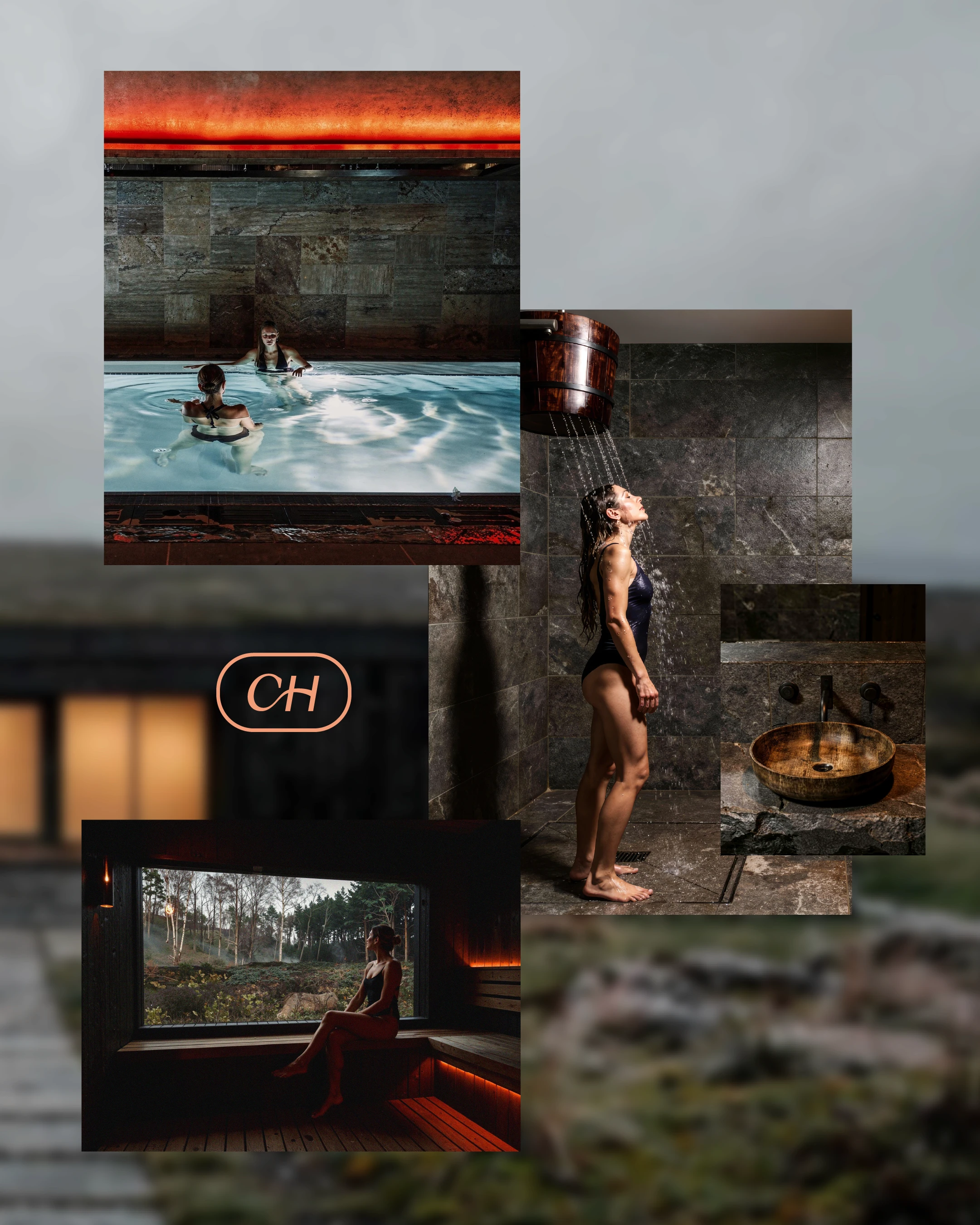
System
Visual Identity
A custom wordmark and CH ligature where the italic C reaches into the roman H — warmth opening into precision.
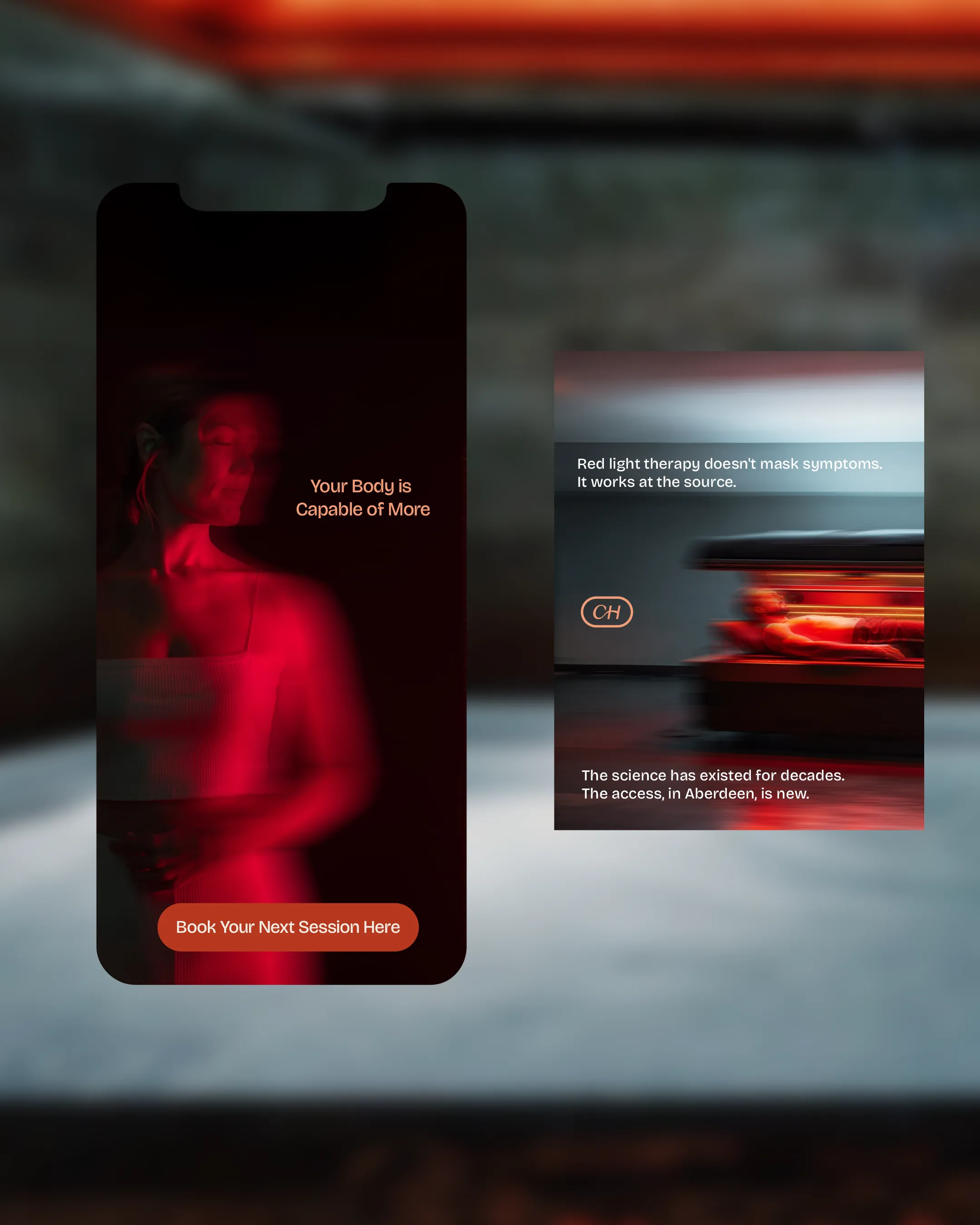
A glow system drawn directly from the red light therapy experience: deep red through amber to peach, set against dark grounds drawn from the Scottish landscape. The colour doesn't reference the therapy. It is the therapy.
Icon System
Five brand icons: recovery, precision, warmth, endurance, sanctuary. Each drawn from the experience of the space rather than generic wellness shorthand.
Applications
Business cards, gift cards, stationery and merchandise with location coordinates (Aberdeen, Scotland · 56°N) grounding the brand in place. Digital and social applications built around the brand's core messaging architecture — outcome first, science in support.
Creative Direction
Photography direction prioritised the outside/inside tension directly: the grey, flat northern light of the Scottish landscape against the warmth and intensity of the treatment environment. Moody, elemental exteriors. Red-lit interiors. The visual contrast does the same work as the strategy — cold outside, restorative within.
Campaign copy followed the same logic: "Your body is capable of more", "Red light therapy doesn't mask symptoms. It works at the source", "Recovery isn't something you squeeze in when you're exhausted".
Visual Identity
A custom wordmark and CH ligature where the italic C reaches into the roman H — warmth opening into precision.
A glow system drawn directly from the red light therapy experience: deep red through amber to peach, set against dark grounds drawn from the Scottish landscape. The colour doesn't reference the therapy. It is the therapy.
Icon System
Five brand icons: recovery, precision, warmth, endurance, sanctuary. Each drawn from the experience of the space rather than generic wellness shorthand.
Applications
Business cards, gift cards, stationery and merchandise with location coordinates (Aberdeen, Scotland · 56°N) grounding the brand in place. Digital and social applications built around the brand's core messaging architecture — outcome first, science in support.
Creative Direction
Photography direction prioritised the outside/inside tension directly: the grey, flat northern light of the Scottish landscape against the warmth and intensity of the treatment environment. Moody, elemental exteriors. Red-lit interiors. The visual contrast does the same work as the strategy — cold outside, restorative within.
Campaign copy followed the same logic: "Your body is capable of more", "Red light therapy doesn't mask symptoms. It works at the source", "Recovery isn't something you squeeze in when you're exhausted".
Outcome
Immediate
A brand with a clear point of view and a visual language that earns the premium positioning Camden's House already occupied. The identity communicates what makes the space different before anyone reads a word of copy.
Long-term
A system built around a genuine strategic tension — not trend or aesthetic — means it holds as the business grows.
New services, new communications and new spaces can all be absorbed without the brand losing its centre.
In practice
Camden's House always had the substance. Hard science, real recovery, a location unlike anywhere else in the Scottish wellness market. The brand now says so.


READY TO BEGIN
Let's Build Something Distinctive
You've done the hard part. You know what your brand should feel like.
Let's make it look that way.

READY TO BEGIN
Let's Build Something Distinctive
You've done the hard part. You know what your brand should feel like.
Let's make it look that way.
READY TO BEGIN
Let's Build Something Distinctive
You've done the hard part. You know what your brand should feel like.
Let's make it look that way.