
Bare Glow
Bare Glow
Year:
Year:
2026
Deliverables:
Deliverables:
Brand Strategy
Brand Strategy
Visual Identity
Creative Direction
Packaging Design
Industry:
Industry:
Beauty | Cosmetics | Makeup
Location:
Location:
Cape Town, South Africa

Before
The skin-first beauty space is crowded with brands saying the same things.
Clean. Glow. Skin-first. These have become category noise rather than meaningful positions.
Bare Glow needed to enter that space with something more specific: not makeup inspired by skincare, but makeup that actually behaves like it. The brief wasn't about aesthetics. It was about translating a behavioural distinction into a brand system that felt credible from packaging to campaign.
This is a concept project developed as a self-initiated brief.
PROCESS
The strategic starting point was a single decision: Bare Glow would be framed around behaviour, not ingredients. Not "what's in it" but "how it feels to wear it all day, without thinking about it."
That meant every design decision had a test: does this lower the pulse when you look at it? Does it feel lived-in rather than styled? Does it trust the person looking at it, or does it over-explain?
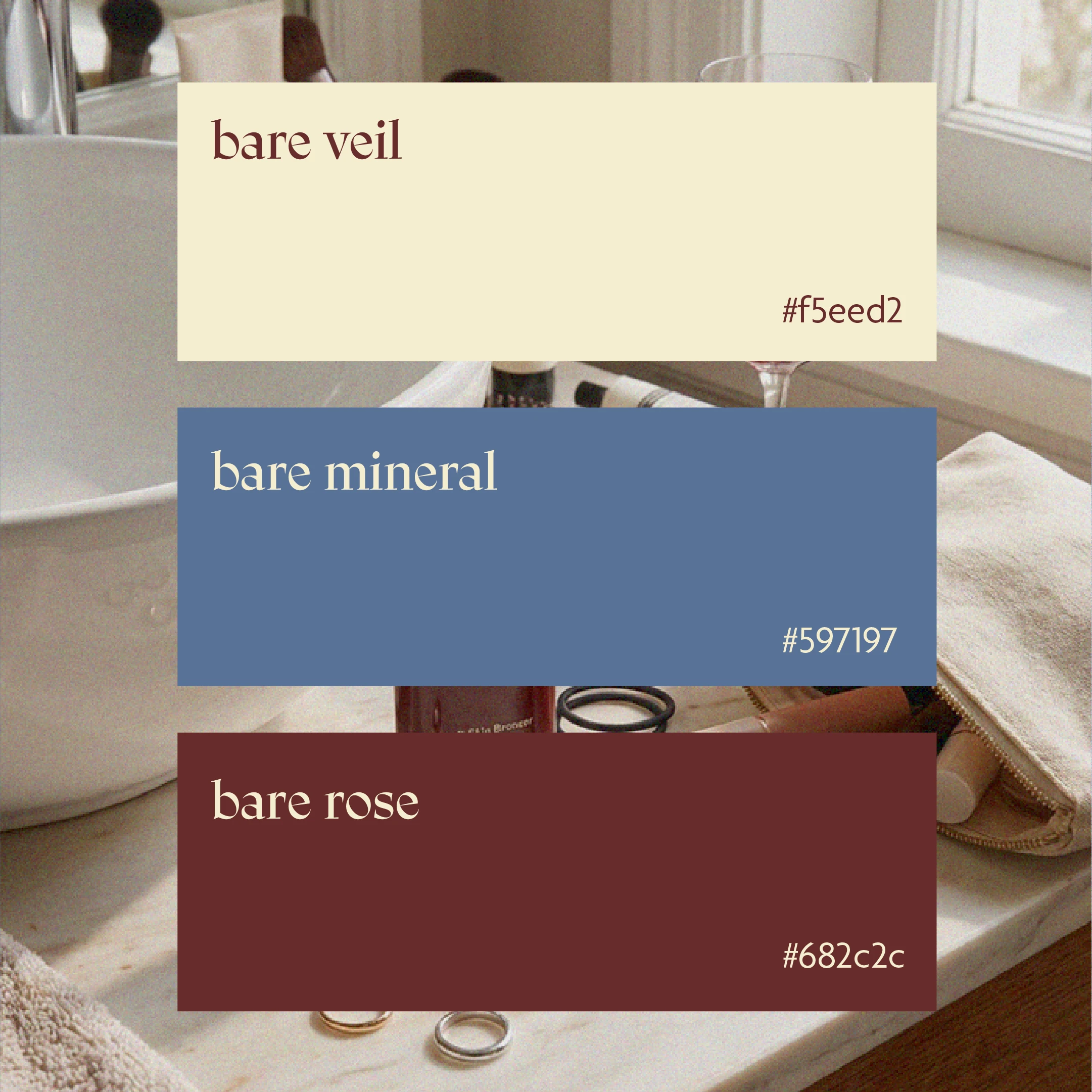
The core colour palette (bare veil, bare mineral and bare rose ) was built from skin-adjacent tones that feel considered without being literal. The typography prioritises calm hierarchy over personality performance. The photography direction prioritises real skin, close proximity and everyday context over editorial distance or clinical precision.
The identity doesn't announce itself loudly. That restraint is the point.
The strategic starting point was a single decision: Bare Glow would be framed around behaviour, not ingredients. Not "what's in it" but "how it feels to wear it all day, without thinking about it."
That meant every design decision had a test: does this lower the pulse when you look at it? Does it feel lived-in rather than styled? Does it trust the person looking at it, or does it over-explain?
The core colour palette (bare veil, bare mineral and bare rose ) was built from skin-adjacent tones that feel considered without being literal. The typography prioritises calm hierarchy over personality performance. The photography direction prioritises real skin, close proximity and everyday context over editorial distance or clinical precision.
The identity doesn't announce itself loudly. That restraint is the point.
The brief wasn't to make something that looked like clean beauty. It was to make something that behaved like it.
System
Visual Identity
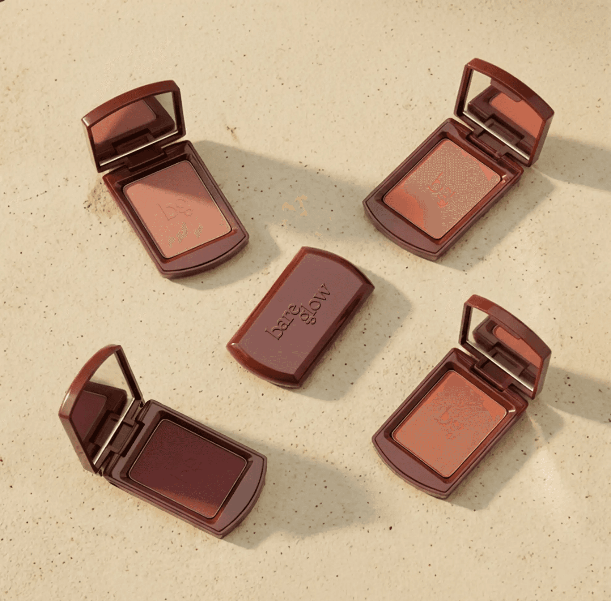
A wordmark and logotype with human softness: rounded forms, open counters, generous spacing. The identity feels modern without being cold, considered without being precious. Colour application is intentional and quiet, with each shade named to reinforce the brand's skin-adjacent language.
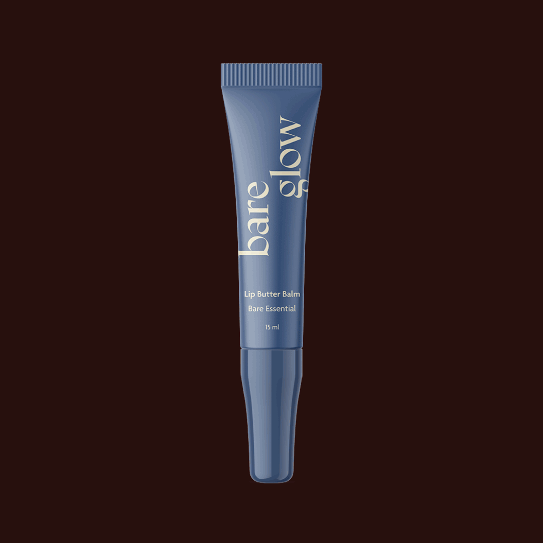
Packaging System
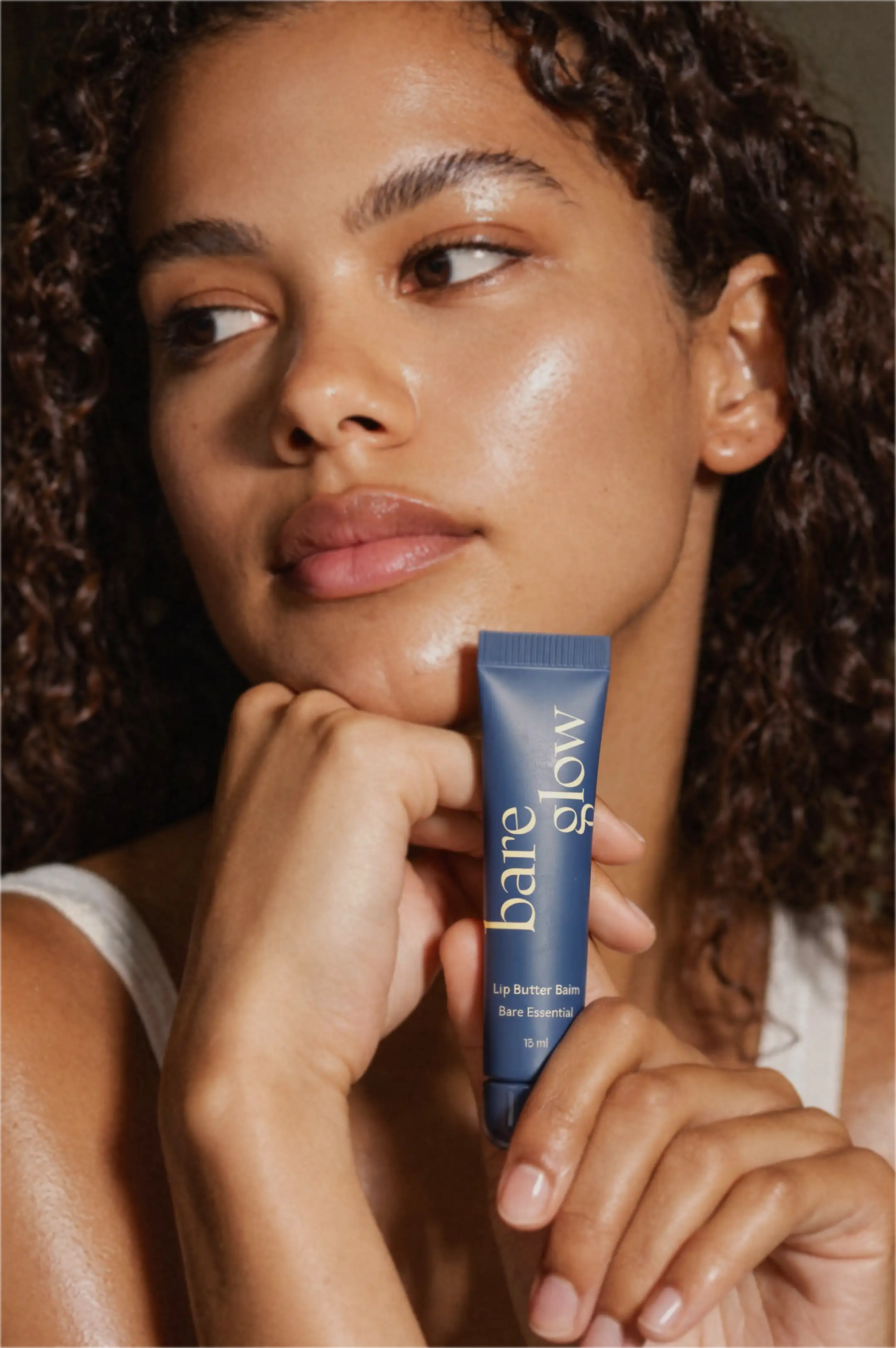
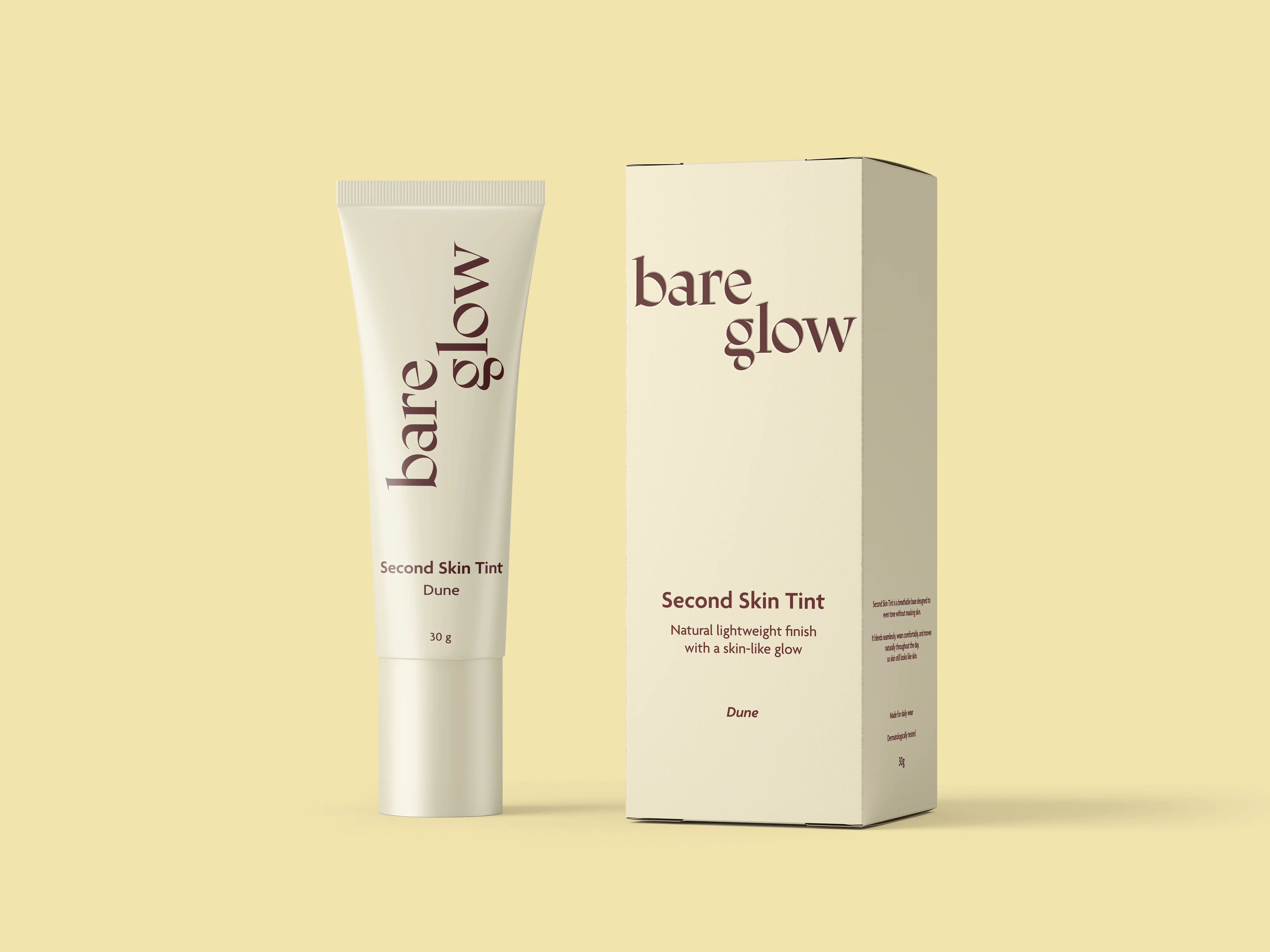
Lip butter balms, skin tints, soft skin bronzers and compact blushes are all built on the same visual logic. Matte and satin finishes, minimal label hierarchy, negative space treated as a feature. The packaging communicates comfort before the product is even opened.
Campaign Direction
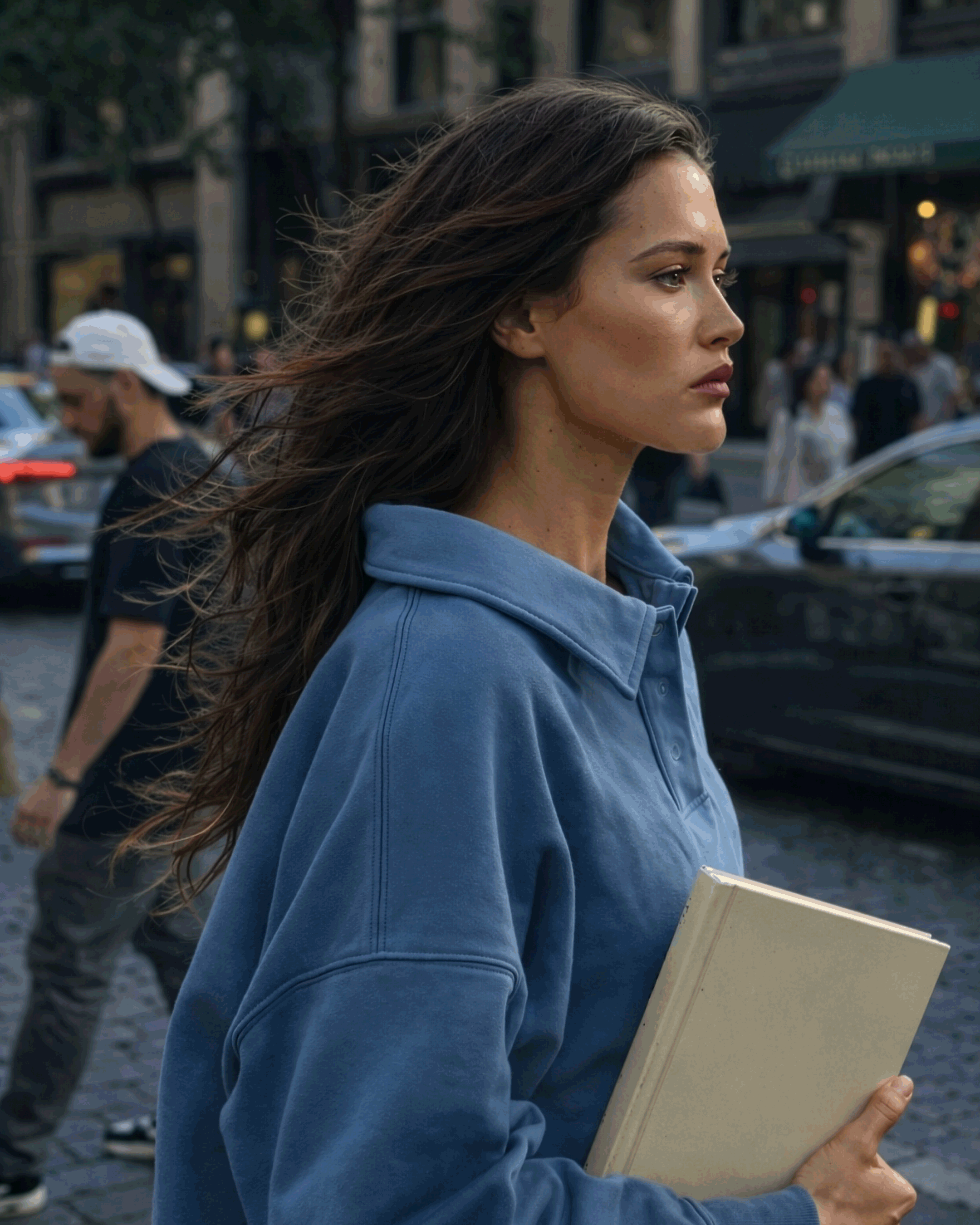
Photography built around closeness, real skin texture and everyday contexts like bathrooms, streets, natural light. Products shown in use or near skin, not isolated as objects. The campaign imagery reinforces the behavioural brief: this is makeup you wear, not makeup you perform.
Decision Criteria
Five behavioural principles giving the brand a clear framework for evaluating future decisions.
Does this lower the pulse? Does it feel lived-in rather than styled? Does it trust the reader, or over-explain?
The criteria protect the system from trend drift without prescribing every application.
Visual Identity
A wordmark and logotype with human softness: rounded forms, open counters, generous spacing. The identity feels modern without being cold, considered without being precious. Colour application is intentional and quiet, with each shade named to reinforce the brand's skin-adjacent language.
Packaging System
Lip butter balms, skin tints, soft skin bronzers and compact blushes are all built on the same visual logic. Matte and satin finishes, minimal label hierarchy, negative space treated as a feature. The packaging communicates comfort before the product is even opened.
Campaign Direction
Photography built around closeness, real skin texture and everyday contexts like bathrooms, streets, natural light. Products shown in use or near skin, not isolated as objects. The campaign imagery reinforces the behavioural brief: this is makeup you wear, not makeup you perform.
Decision Criteria
Five behavioural principles giving the brand a clear framework for evaluating future decisions.
Does this lower the pulse? Does it feel lived-in rather than styled? Does it trust the reader, or over-explain?
The criteria protect the system from trend drift without prescribing every application.
Outcome
Immediate
A brand ready to launch with visual coherence across packaging, digital and campaign from day one. No gap between the strategy and what the work actually looks like.
Long-term
A system built on restraint rather than trend means the identity holds up as the product range extends. New SKUs, new campaigns and new contexts can all be absorbed without the brand needing to reinvent itself.
In practice
Bare Glow looks like what it says it is. That consistency — between claim and appearance, between strategy and execution — is what builds trust with an audience who can tell the difference.

READY TO BEGIN
Let's Build Something Distinctive
You've done the hard part. You know what your brand should feel like.
Let's make it look that way.

READY TO BEGIN
Let's Build Something Distinctive
You've done the hard part. You know what your brand should feel like.
Let's make it look that way.
READY TO BEGIN
Let's Build Something Distinctive
You've done the hard part. You know what your brand should feel like.
Let's make it look that way.