Flower Power
Flower Power
Year:
Year:
2023
Deliverables:
Deliverables:
Brand Strategy
Brand Strategy
Visual Identity
Creative Direction
Packaging Design
Industry:
Industry:
Floristry
Location:
Location:
Johannesburg, South Africa
Before
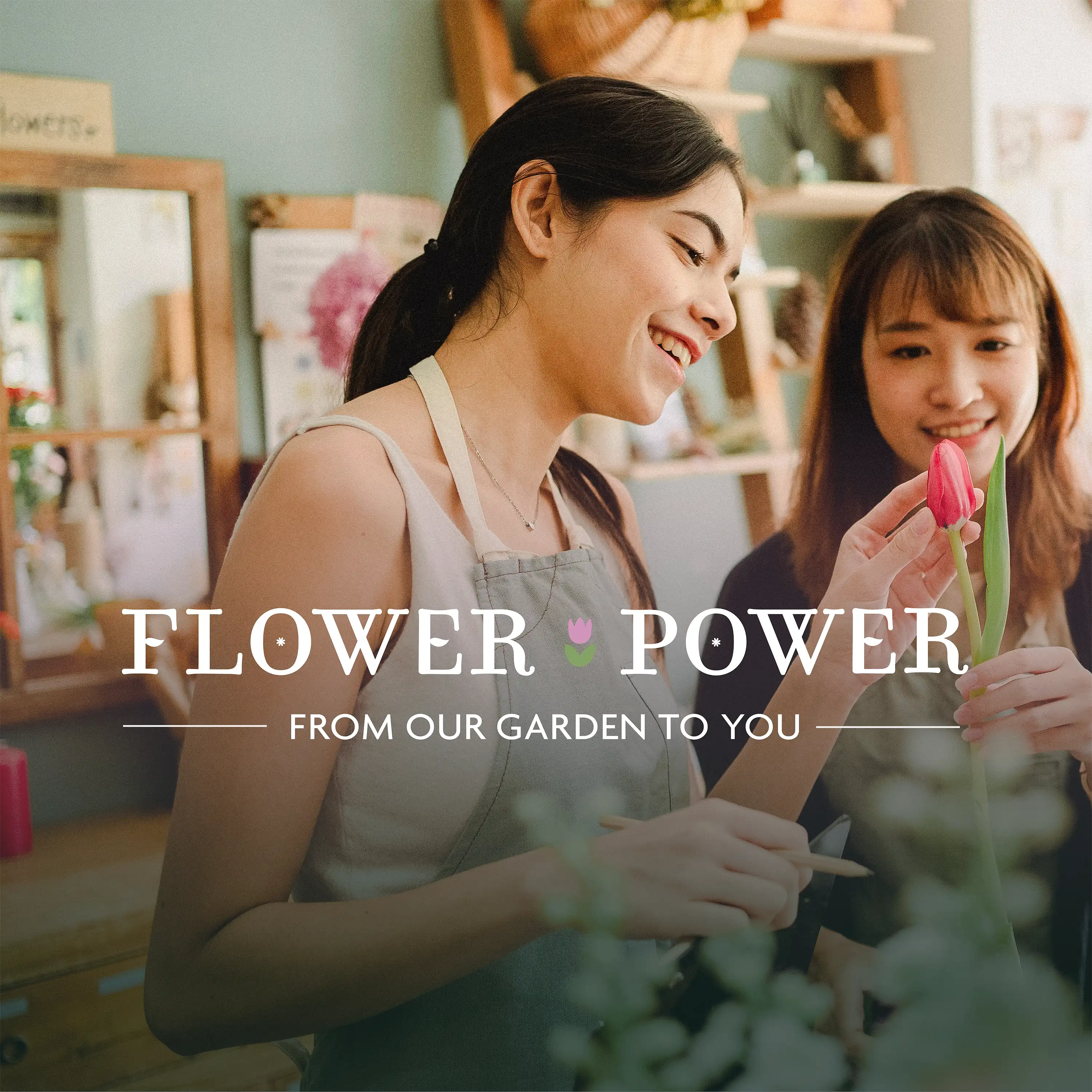
Flower Power had a Canva logo and an inconsistent Instagram presence for 3 years. They lost a premium wedding venue partnership because they didn't look established enough despite excellent floral work.
The brand had a clear instinct — personalised care — but no system to express it.
This is a concept project exploring how brand strategy might approach this brief.
PROCESS
The brief centred on one question: what does "personalised care" actually need to communicate in a market full of predictable floristry clichés?
The answer became the strategic foundation: approachability with credibility, warmth without amateurism, craft without cliché.
Every visual decision supported that strategy. Two directions were developed and evaluated against the core business goal — competing for premium venue partnerships.
The brief wasn't to impose an aesthetic — it was to find the system already implied by the brand's instinct.
System
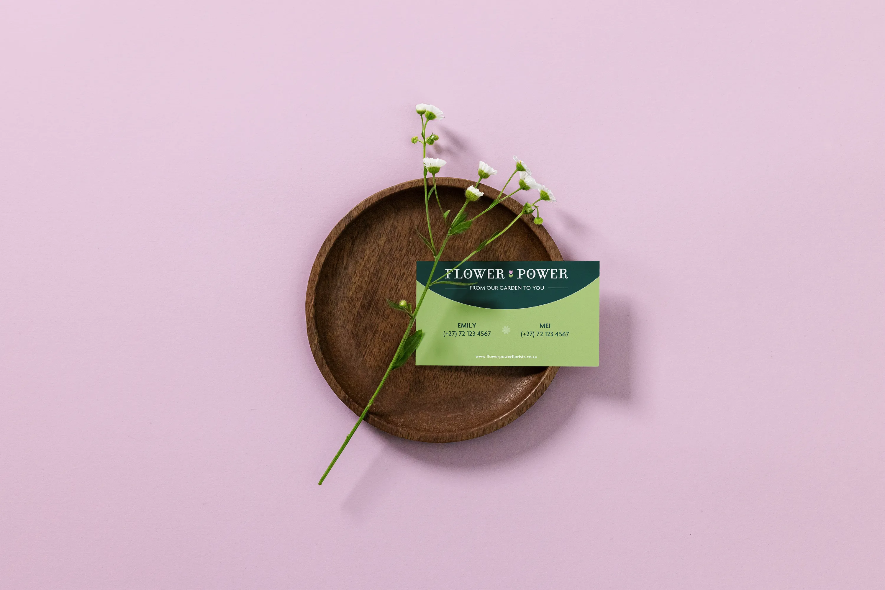
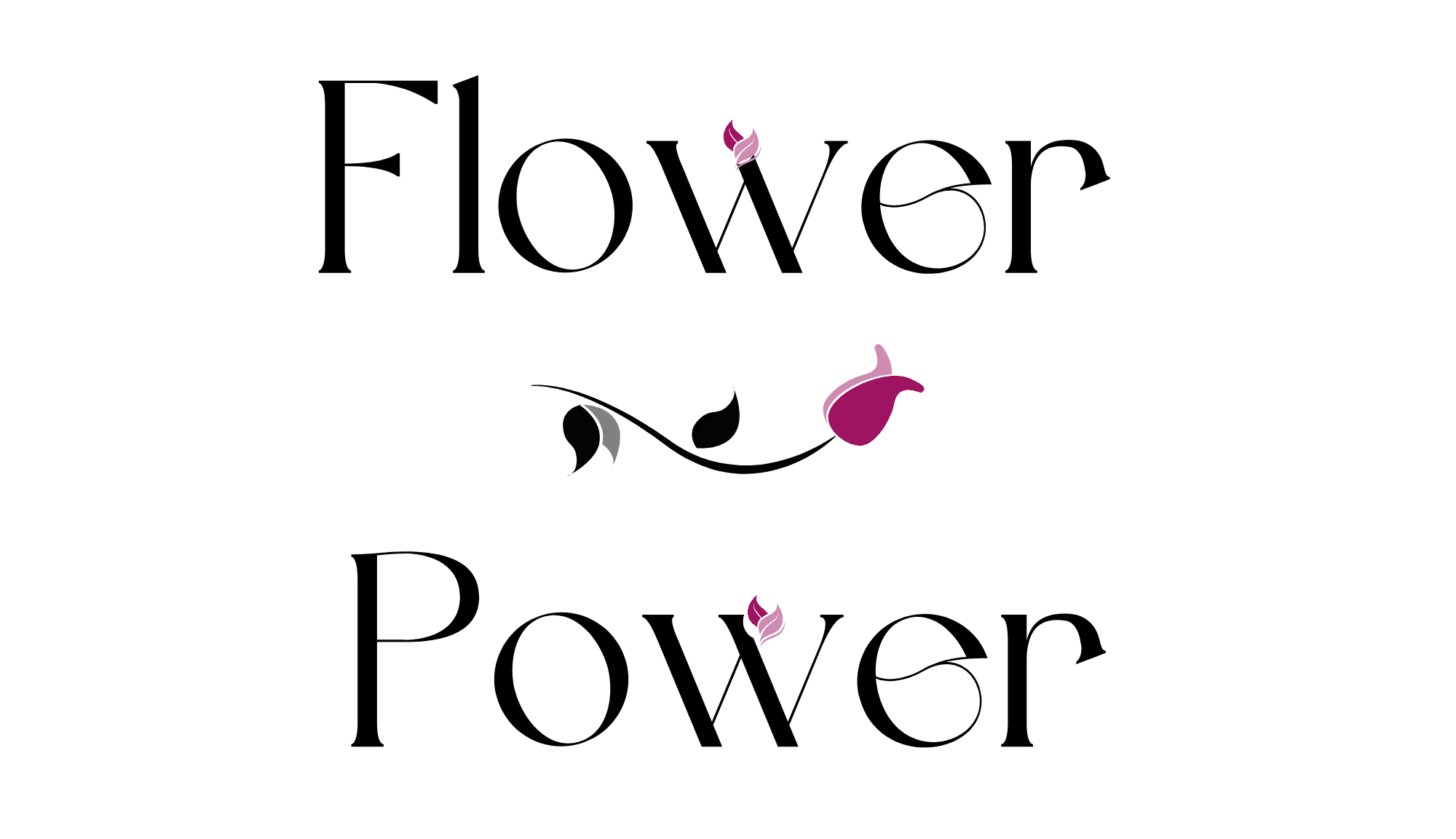
Visual Identity
Logo suite (primary, secondary and stacked variations), with a logomark blending tulip and hand-shaped vase forms to communicate personalised care without stating it. Colour palette of deep greens, clay, lavender and soft neutrals. Typography balancing warmth with readability. Illustrative elements that avoid predictable floral clichés.
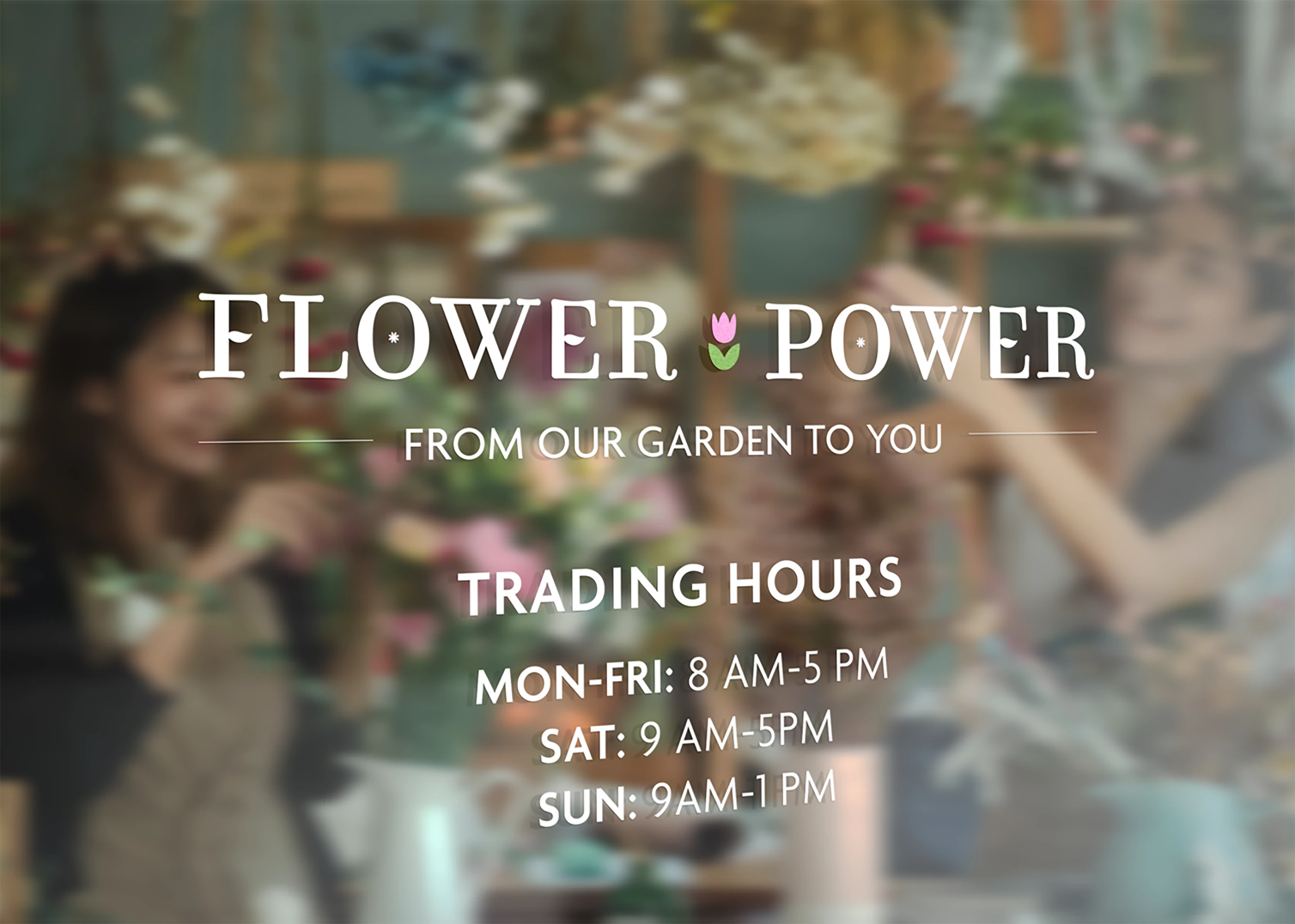
Applications
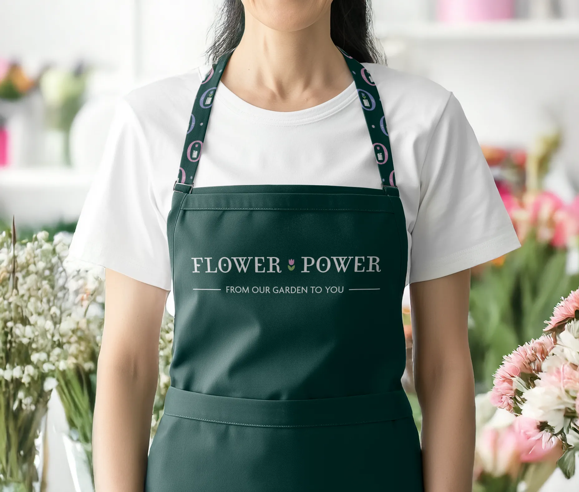
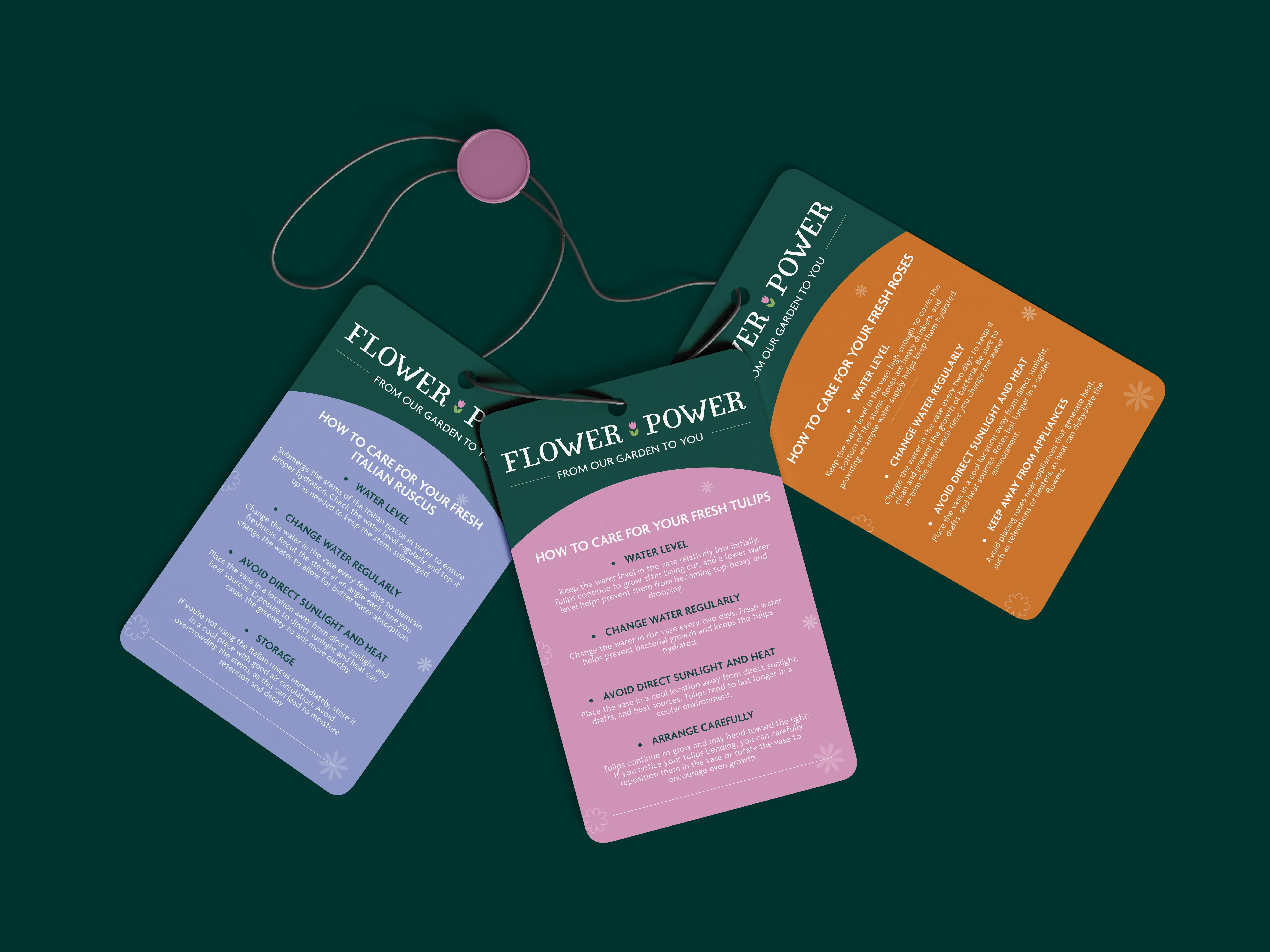
Packaging, stationery, staff aprons, signage and digital templates. Scaled to work from tiny care tags to large event installations.
Brand Guidelines
A practical reference for applying the brand consistently, without needing designer sign-off each time.
Visual Identity
Logo suite (primary, secondary and stacked variations), with a logomark blending tulip and hand-shaped vase forms to communicate personalised care without stating it. Colour palette of deep greens, clay, lavender and soft neutrals. Typography balancing warmth with readability. Illustrative elements that avoid predictable floral clichés.
Applications
Packaging, stationery, staff aprons, signage and digital templates. Scaled to work from tiny care tags to large event installations.
Brand Guidelines
A practical reference for applying the brand consistently, without needing designer sign-off each time.
Outcome
In this concept, the intended outcomes were:
Immediate
A founder confident enough to pitch premium partnerships previously avoided. When that wedding venue opportunity came around again, Flower Power could present a visual presence that matched the quality of their work.
Long-term
The team produces seasonal packaging, event signage and social content consistently without constant founder oversight. A colour system clear enough that "should I use this colour?" becomes a question that answers itself.
In practice
The brand reflects what was always true about the business, just structured so others could see it too. Premium clients no longer need convincing that Flower Power is "established enough."


READY TO BEGIN
Let's Build Something Distinctive
You've done the hard part. You know what your brand should feel like.
Let's make it look that way.

READY TO BEGIN
Let's Build Something Distinctive
You've done the hard part. You know what your brand should feel like.
Let's make it look that way.
READY TO BEGIN
Let's Build Something Distinctive
You've done the hard part. You know what your brand should feel like.
Let's make it look that way.