
Reformr Pilates Studio
Reformr Pilates Studio
Year:
Year:
2026
Deliverables:
Deliverables:
Brand Strategy
Brand Strategy
Visual Identity
Creative Direction
Marketing Collateral
Industry:
Industry:
Pilates | Fitness | Wellness
Location:
Location:
South Africa

Before
Pilates studios tend to brand in one of two directions: the soft, feminine wellness aesthetic, or the high-performance biohacking world of metrics & optimisation. Neither leaves much room for something more grounded.
Reformr is built around a single principle: control. Not control as a wellness concept, but as a physical practice: precise, repeatable, demanding. I wanted to build a brand that communicated that discipline without tipping into either aesthetic extreme.
Premium but hardworking. Clean without being clinical.
PROCESS
The strategic starting point was finding what "control" actually meant for this brand, and pushing past the obvious. Control as a physical practice is expected in pilates.
What made Reformr distinct was the idea that the discipline built on the reformer doesn't stay there. It transfers. It becomes a way of moving through the rest of your life.
That dual meaning became the foundation for everything: the messaging, the visual language, the collateral.
Control as a concept is expected in pilates. Control as a way of life is a different proposition entirely.
System
Visual Identity
A customised wordmark where the letterforms have been refined. It has a monospace font for "Pilates Studio" — a subtle retro edge that reads as considered. The secondary logo use RE and R in monoline circles as micrographics, with "form" sitting between them.
Messaging System
Where control becomes second nature — brand positioning
Control, until it's just how you live — tagline
Repeat until it's reflex — member card
Something shifts. Every time — brand promise
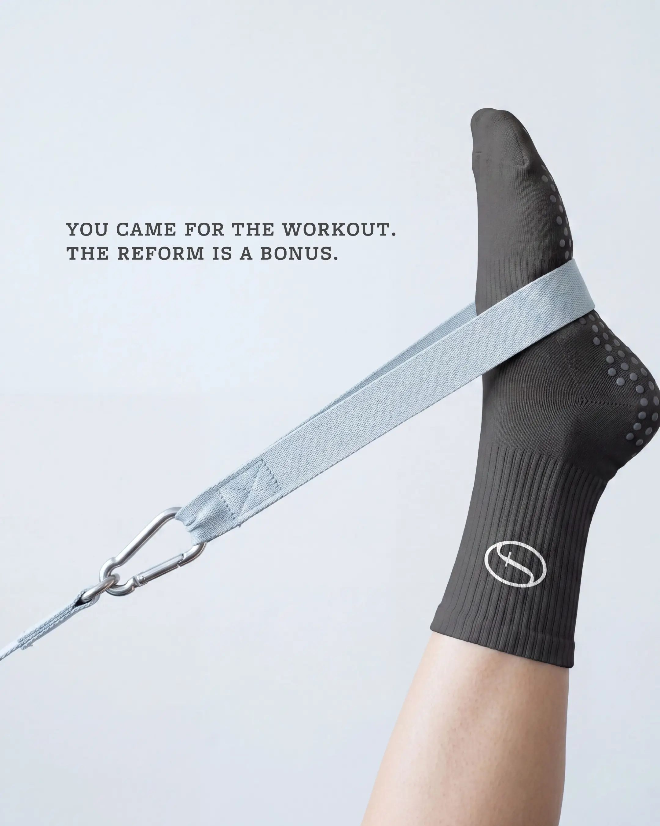
You came for the workout. The reform is a bonus — brand campaign
Art Direction
Body geometry over lifestyle aspiration. Form as subject, equipment as context.
Colour & Typography
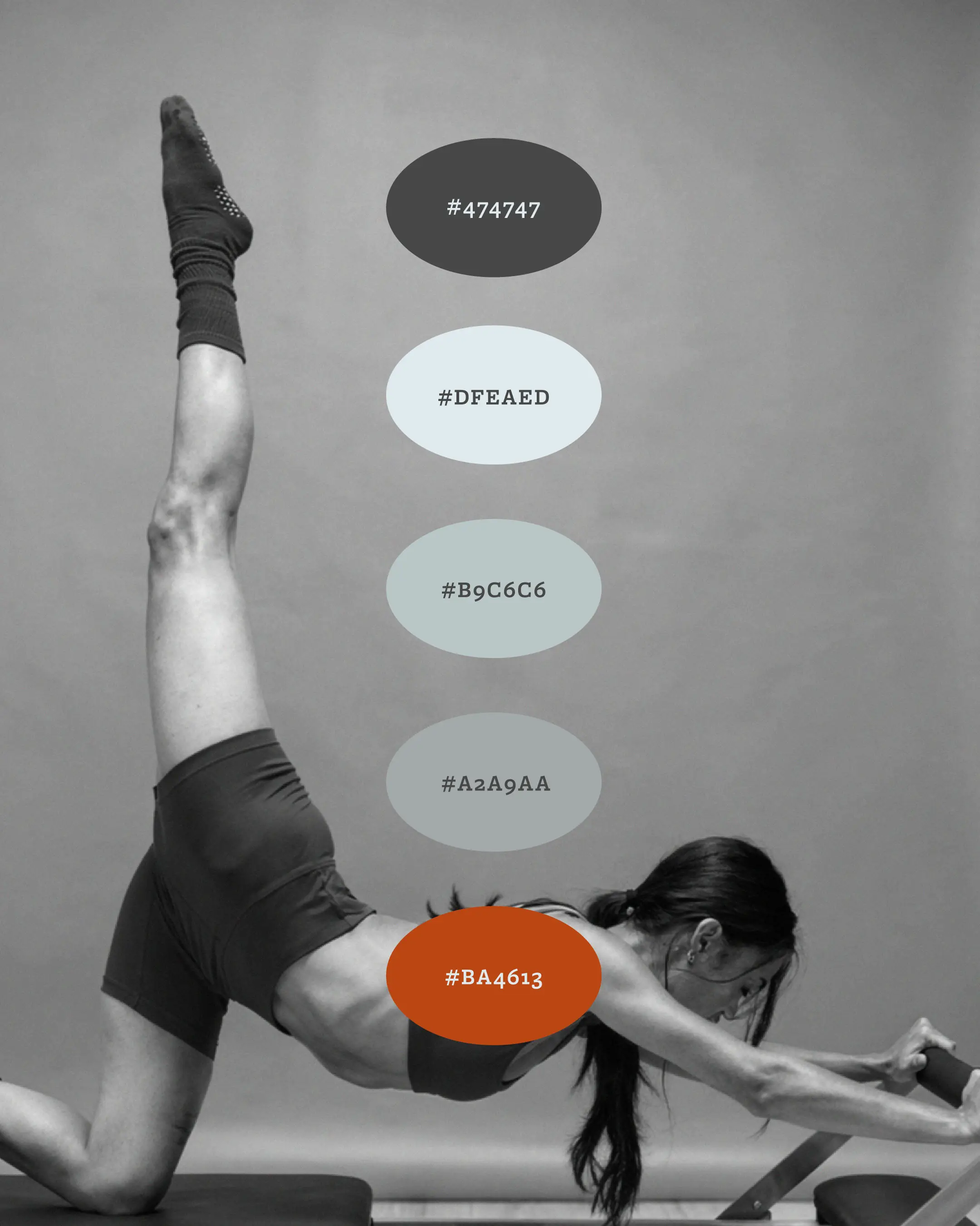
A restrained palette of neutral greys, light grey-green and light grey-blue, and a single burnt orange accent that carries the brand's energy. Typography is structured, precise and uncomplicated, echoing the practice itself.
Collateral
The brand applied across a full studio suite: loyalty stamp card with free tote reward, membership card and lanyard, printed collateral and social media design.
Visual Identity
A customised wordmark where the letterforms have been refined. It has a monospace font for "Pilates Studio" — a subtle retro edge that reads as considered. The secondary logo use RE and R in monoline circles as micrographics, with "form" sitting between them.
Messaging System
Where control becomes second nature — brand positioning
Control, until it's just how you live — tagline
Repeat until it's reflex — member card
Something shifts. Every time — brand promise
You came for the workout. The reform is a bonus — brand campaign
Art Direction
Body geometry over lifestyle aspiration. Form as subject, equipment as context.
Colour & Typography
A restrained palette of neutral greys, light grey-green and light grey-blue, and a single burnt orange accent that carries the brand's energy. Typography is structured, precise and uncomplicated, echoing the practice itself.
Collateral
The brand applied across a full studio suite: loyalty stamp card with free tote reward, membership card and lanyard, printed collateral and social media design.
Outcome
Immediate
A brand that communicates control before a word is read. The identity holds across every touchpoint, from the card in a member's wallet to the campaign image on social media.
Long-term
A system built on a transferable idea means it grows with the studio. As Reformr expands — new locations, new formats, new campaigns — the brand has a foundation that can absorb that growth without needing to reinvent itself.
In practice
Reformr looks like what it is: a studio that takes the work seriously. That's what earns trust with the client who has tried every boutique fitness brand and wants something with real substance behind it.


READY TO BEGIN
Let's Build Something Distinctive
You've done the hard part. You know what your brand should feel like.
Let's make it look that way.

READY TO BEGIN
Let's Build Something Distinctive
You've done the hard part. You know what your brand should feel like.
Let's make it look that way.
READY TO BEGIN
Let's Build Something Distinctive
You've done the hard part. You know what your brand should feel like.
Let's make it look that way.