Kidney Buds
Kidney Buds
Year:
Year:
2025
Deliverables:
Deliverables:
Brand Strategy
Brand Strategy
Visual Identity
Custom Illustrations
Industry:
Industry:
Health Care, Paediatrics, Nephrology
Location:
Location:
Johannesburg, South Africa
Before
Kidney Buds is the paediatric nephrology unit at Chris Hani Baragwanath Hospital in Johannesburg. A specialist unit caring for children with kidney conditions, working with families who are often frightened, confused, and navigating a system that can feel overwhelming.
The unit had no visual identity to speak of. Nothing that said: this is a place that sees you, that you can trust, that is built around your child.
PROCESS
The brief had two audiences pulling in different directions. For families and young patients, the brand needed to feel calm, approachable and human. For clinicians and hospital stakeholders, it needed to carry weight and credibility. Getting both right meant the visual language couldn't lean too far in either direction.
Before any design decisions were made, time was spent understanding where the brand would actually live: letters and forms, waiting room materials, staff documentation, items children would hold and interact with. That context shaped everything.
The identity draws from early kidney development, translated into simple organic forms that feel gentle without being literal or clinical. The goal was to make something that reduced fear without being patronising — to children or their parents.
Most medical branding either feels cold or tries too hard to be friendly.
The brief was to find the space between.
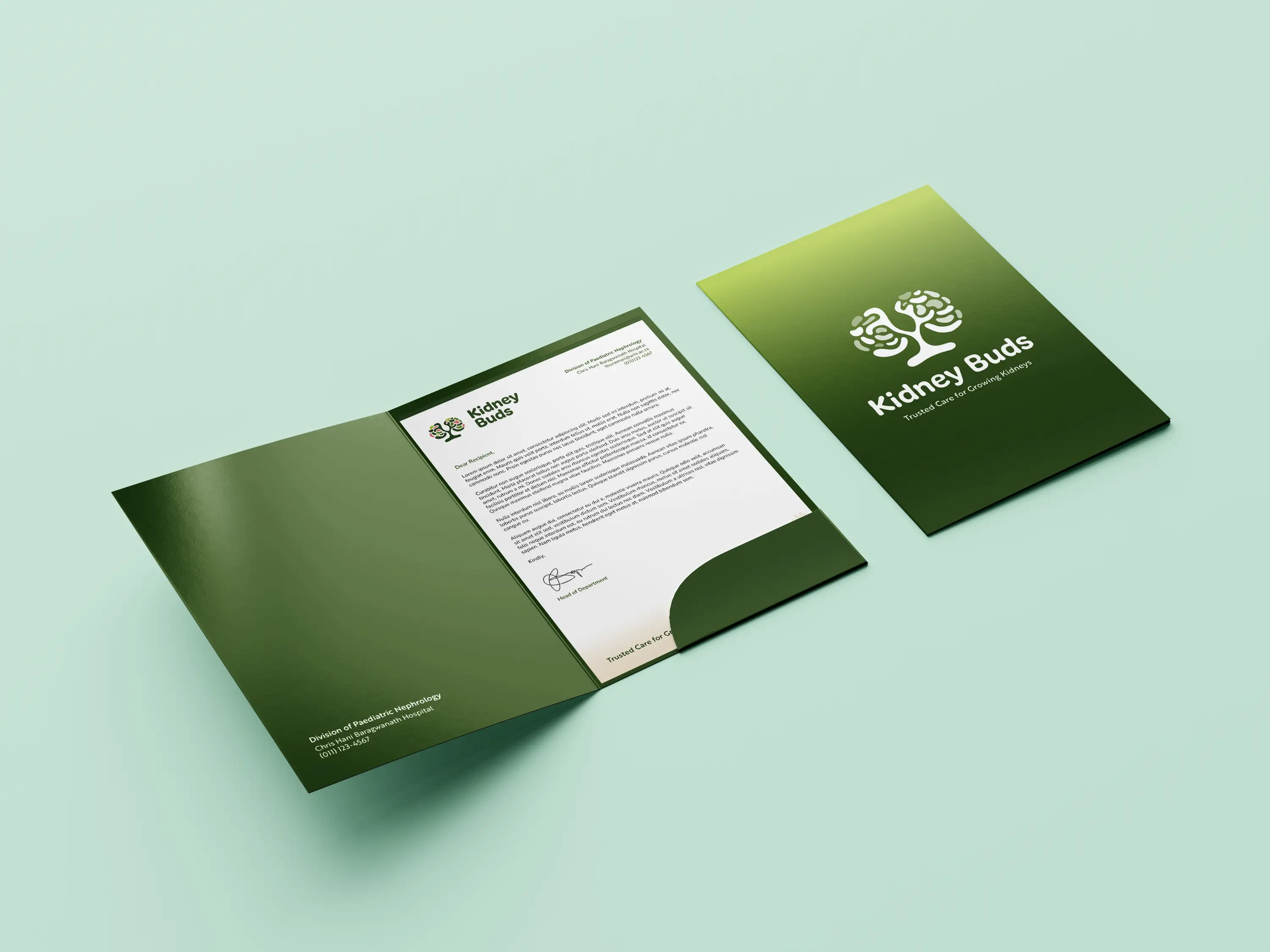
System
Visual Identity
A logo and illustration system rooted in organic, simplified forms drawn from kidney development. Colour and typographic choices prioritised calmness, legibility and ease across all materials.
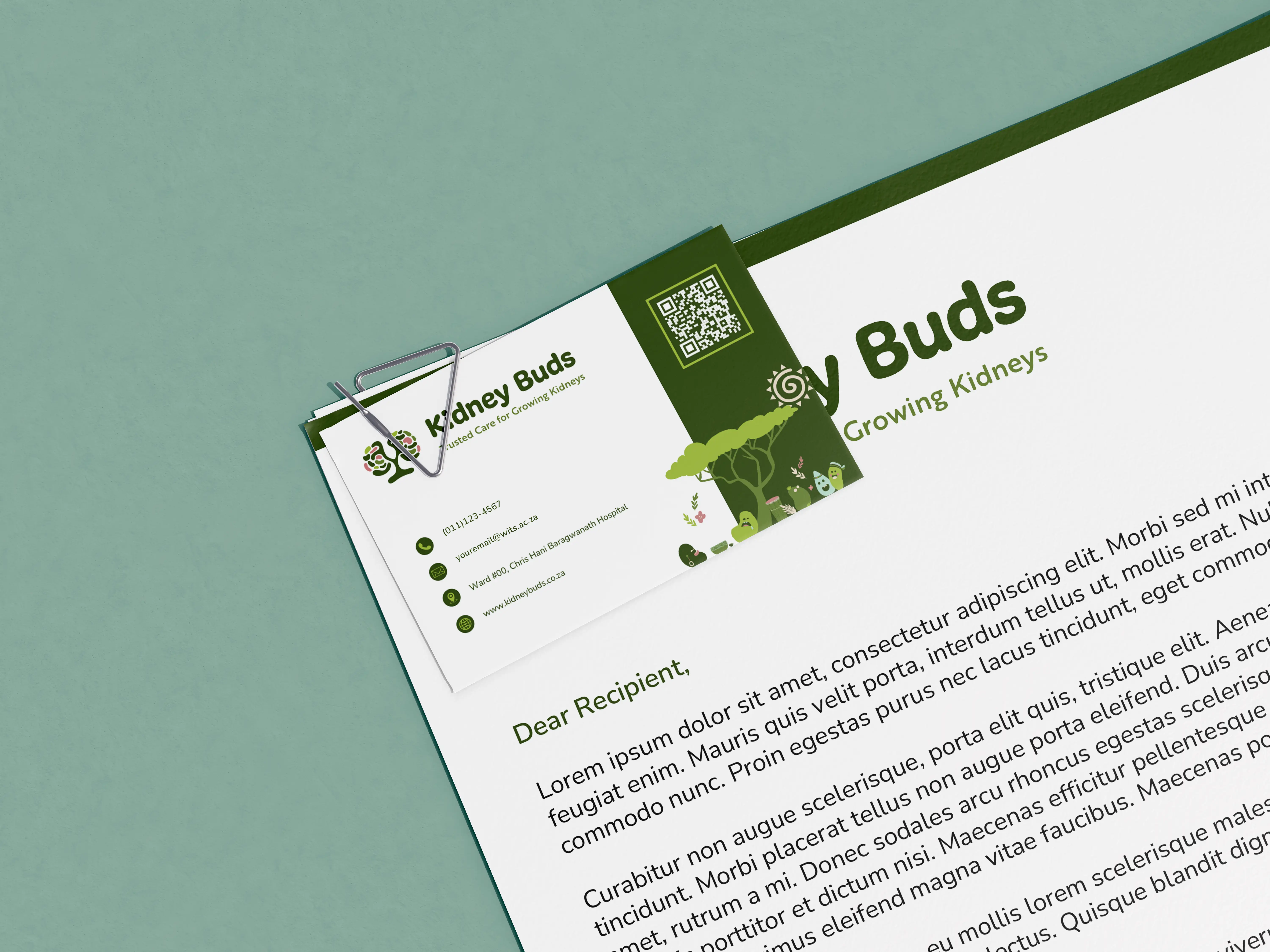
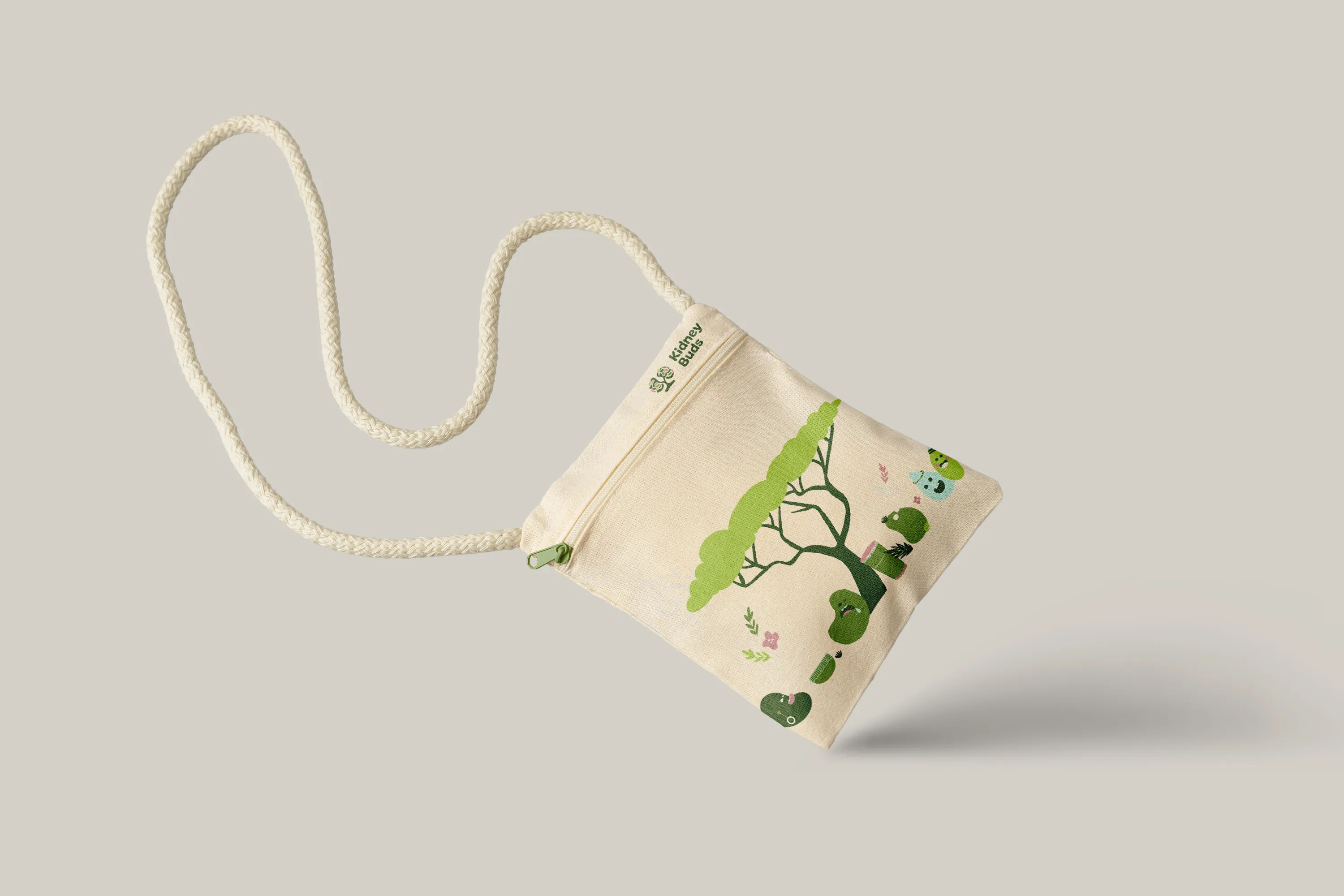
Custom Illustrations
A set of simplified illustrations designed to make complex medical ideas feel less intimidating, particularly for children. Grounded in real science, but gentle enough to belong in a space where children spend time waiting and receiving care.
Applications
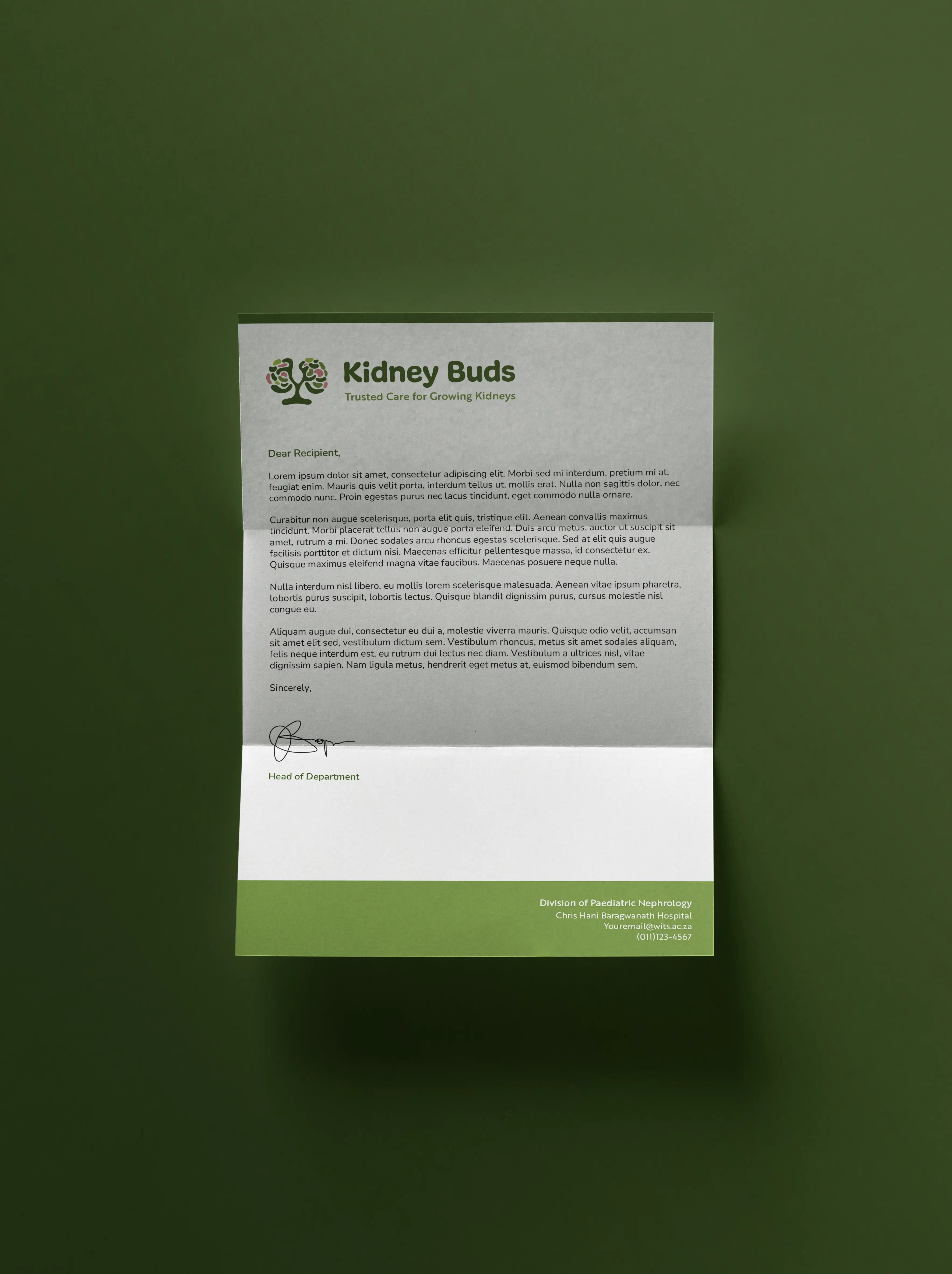
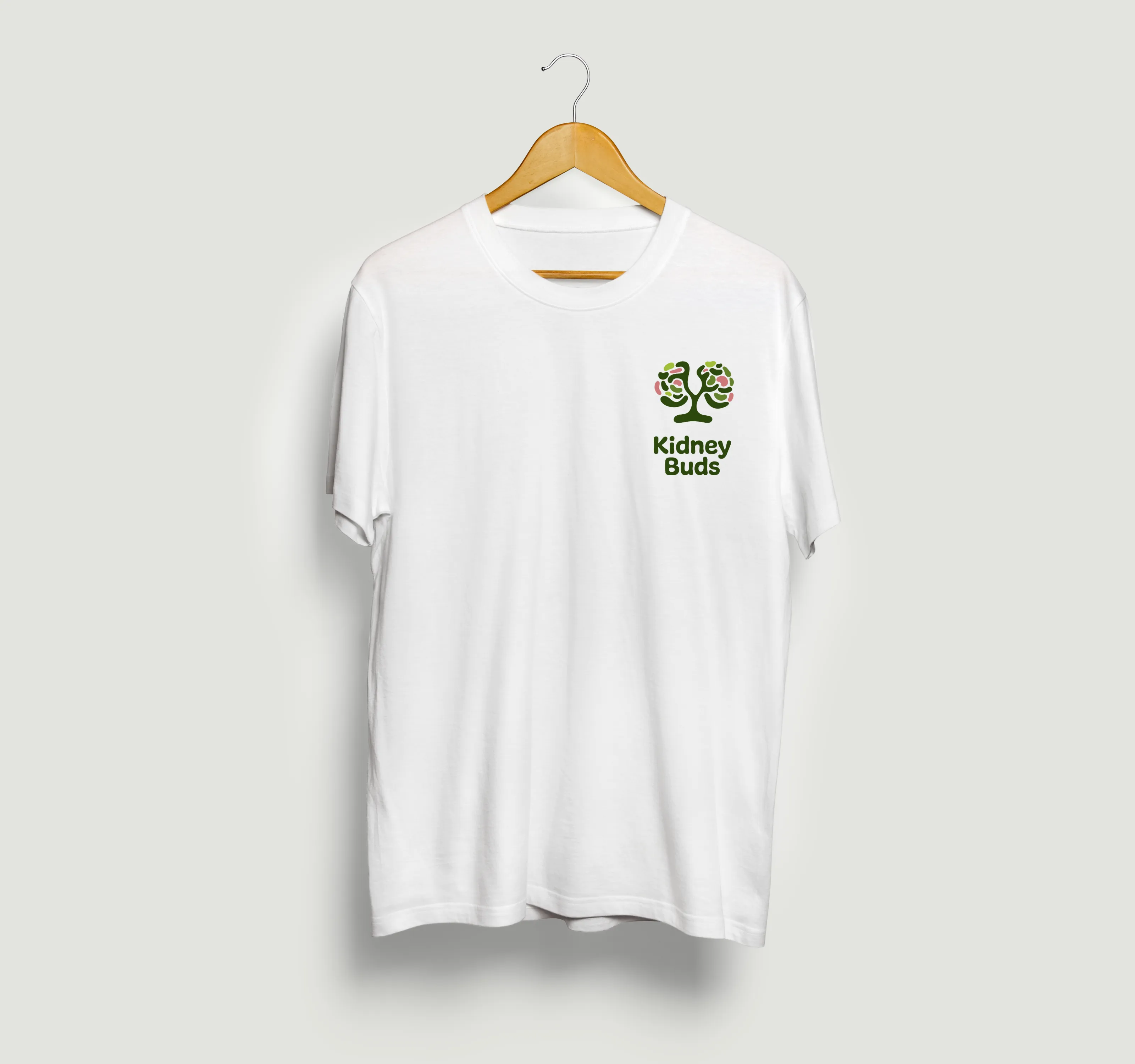
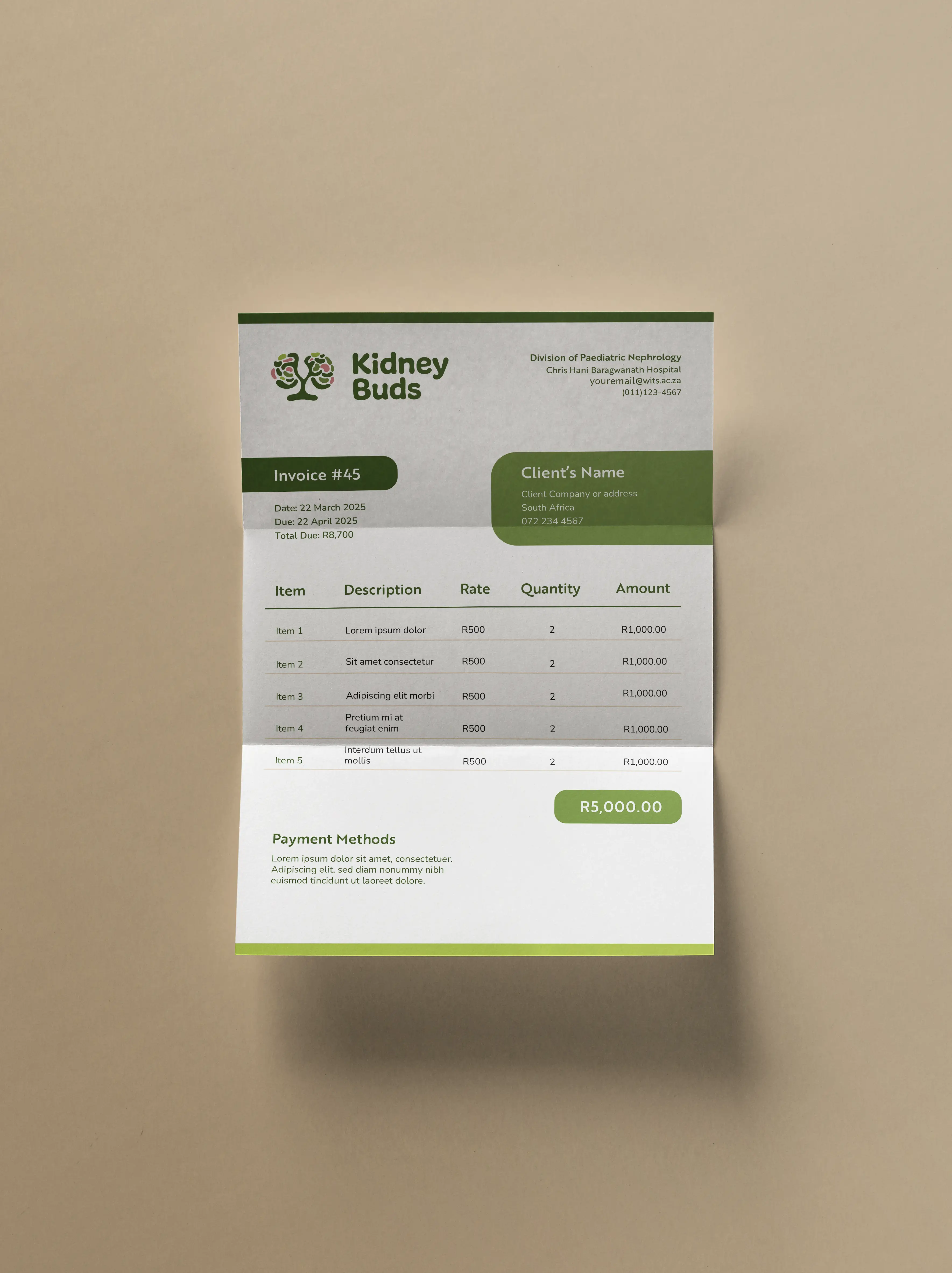
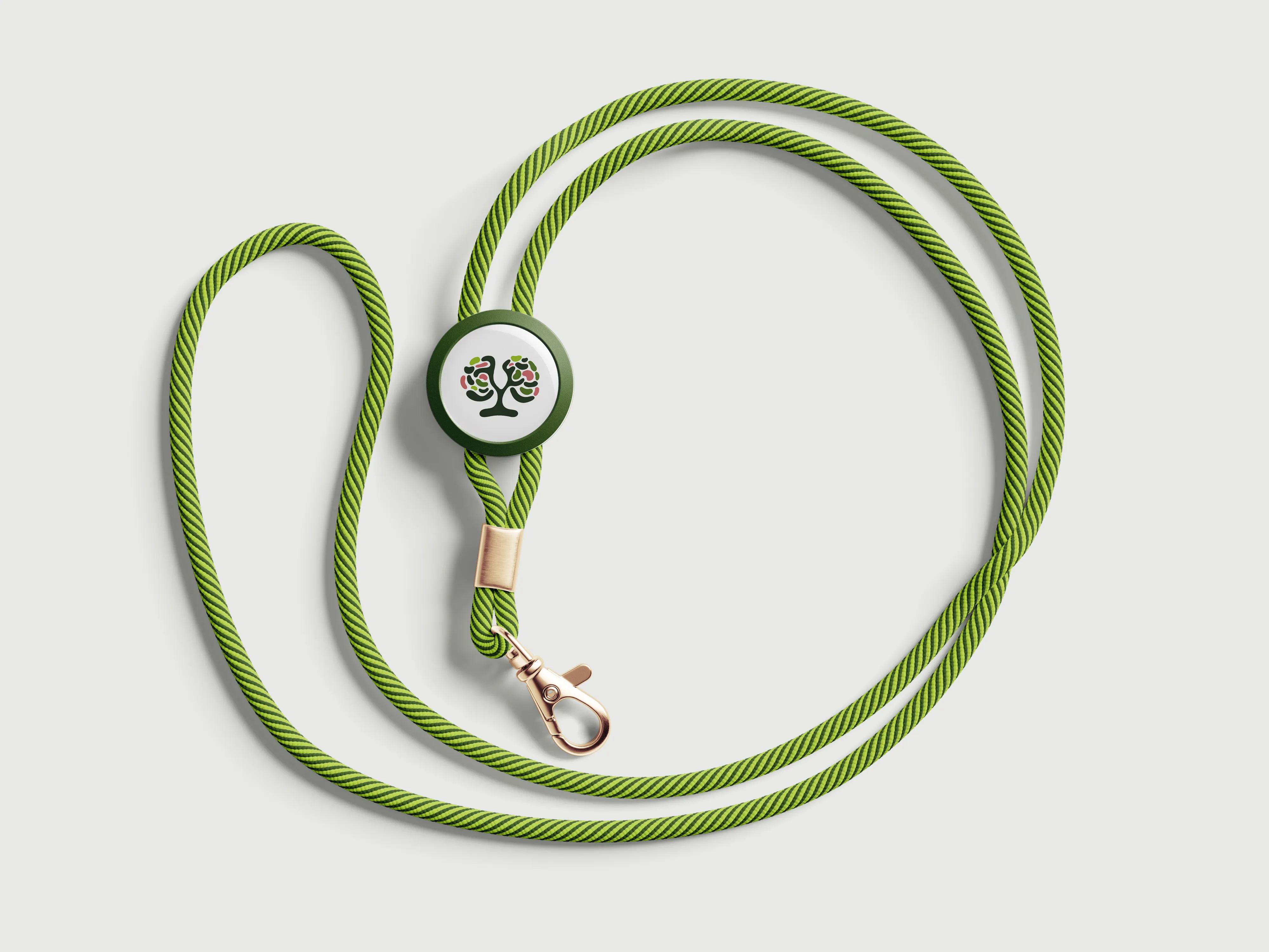
Stationery, staff materials, patient-facing documents and items used directly by children and families — all built for consistency without rigidity.
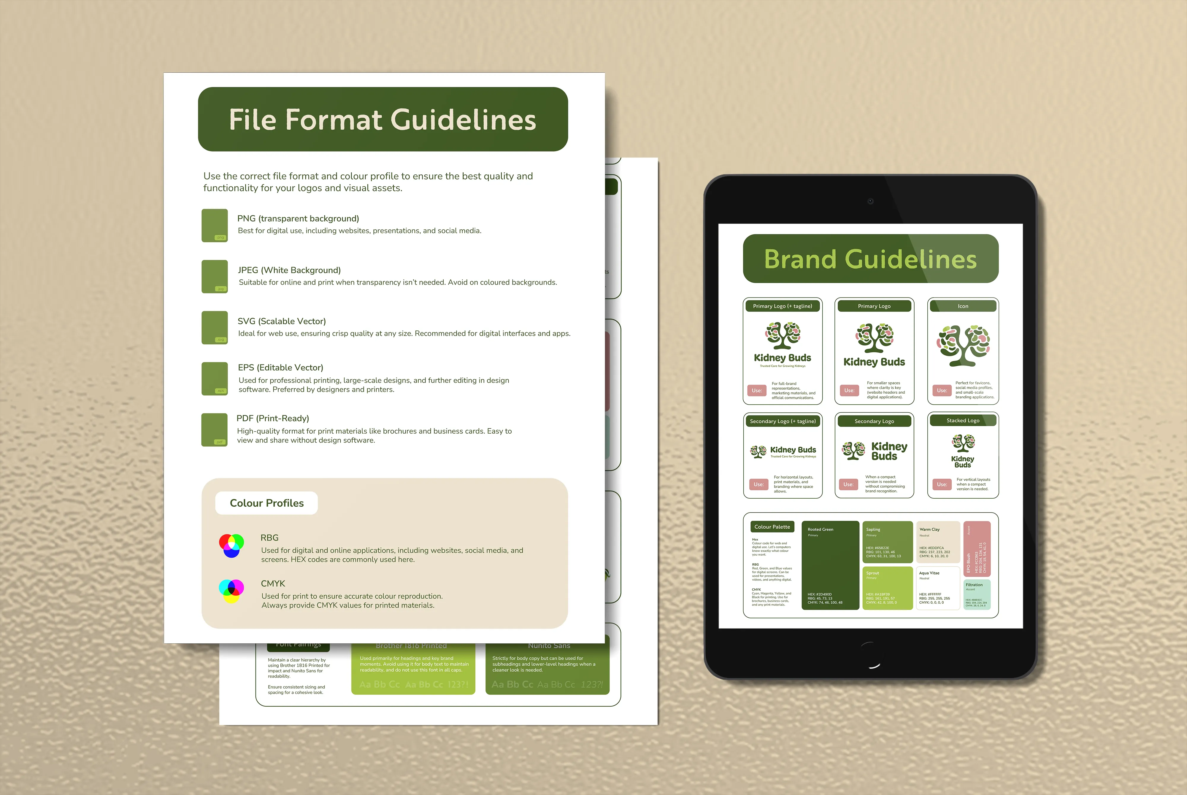
Brand Guidelines
Clear guidance for applying the identity across both clinical and patient-facing contexts, so the brand remains cohesive wherever it appears in the unit.
Visual Identity
A logo and illustration system rooted in organic, simplified forms drawn from kidney development. Colour and typographic choices prioritised calmness, legibility and ease across all materials.
Custom Illustrations
A set of simplified illustrations designed to make complex medical ideas feel less intimidating, particularly for children. Grounded in real science, but gentle enough to belong in a space where children spend time waiting and receiving care.
Applications
Stationery, staff materials, patient-facing documents and items used directly by children and families — all built for consistency without rigidity.
Brand Guidelines
Clear guidance for applying the identity across both clinical and patient-facing contexts, so the brand remains cohesive wherever it appears in the unit.
Outcome
Immediate
Kidney Buds had a visual identity that matched the quality of care the unit provides. Staff had materials they could use with confidence, and families encountered a brand that felt considered rather than generic.
Long-term
A flexible system means the identity can extend into new materials and touchpoints as the unit grows, without needing to rebuild from scratch. The illustration system in particular can scale to support patient education and communication over time.
In practice
For a child sitting in a waiting room, or a parent reading a letter about their child's diagnosis, the brand does something quiet but important: it signals that someone thought about them when they made this. That's what the identity was built to do.

READY TO BEGIN
Let's Build Something Distinctive
You've done the hard part. You know what your brand should feel like.
Let's make it look that way.

READY TO BEGIN
Let's Build Something Distinctive
You've done the hard part. You know what your brand should feel like.
Let's make it look that way.
READY TO BEGIN
Let's Build Something Distinctive
You've done the hard part. You know what your brand should feel like.
Let's make it look that way.