
Year:
Year:
2025
Deliverables:
Deliverables:
Brand Strategy
Brand Strategy
Visual Identity
Web Design
Marketing Collateral
Industry:
Industry:
Offshore Energy, Logistics & Workforce Solutions
Location:
Location:
Perth, Australia
Before
Eris had just spun out of the Kuiper Group as an independent workforce and logistics provider. The team had over a decade of experience, 80+ completed projects, and 2,200+ personnel. All of that credibility had been built under someone else's name.
The problem wasn't starting from scratch. It was that without a brand of their own, it could look like they had.
PROCESS
Independence needed to be visible, not just structural.
So before any design decisions were made, the focus was on understanding what Eris actually needed the brand to do: hold its own in front of clients who'd previously seen Kuiper's name behind the work.
Two things needed to be true at once. The brand had to feel credible in technically demanding environments like offshore energy, defence and decommissioning. And it had to reflect that the work is really about people: the right ones, on-site, on time.
Most competitors lean into one and lose the other. The visual system was built to hold both.
The goal wasn't to look like a new company. It was to look like a company that had earned its independence.
System
Visual Identity
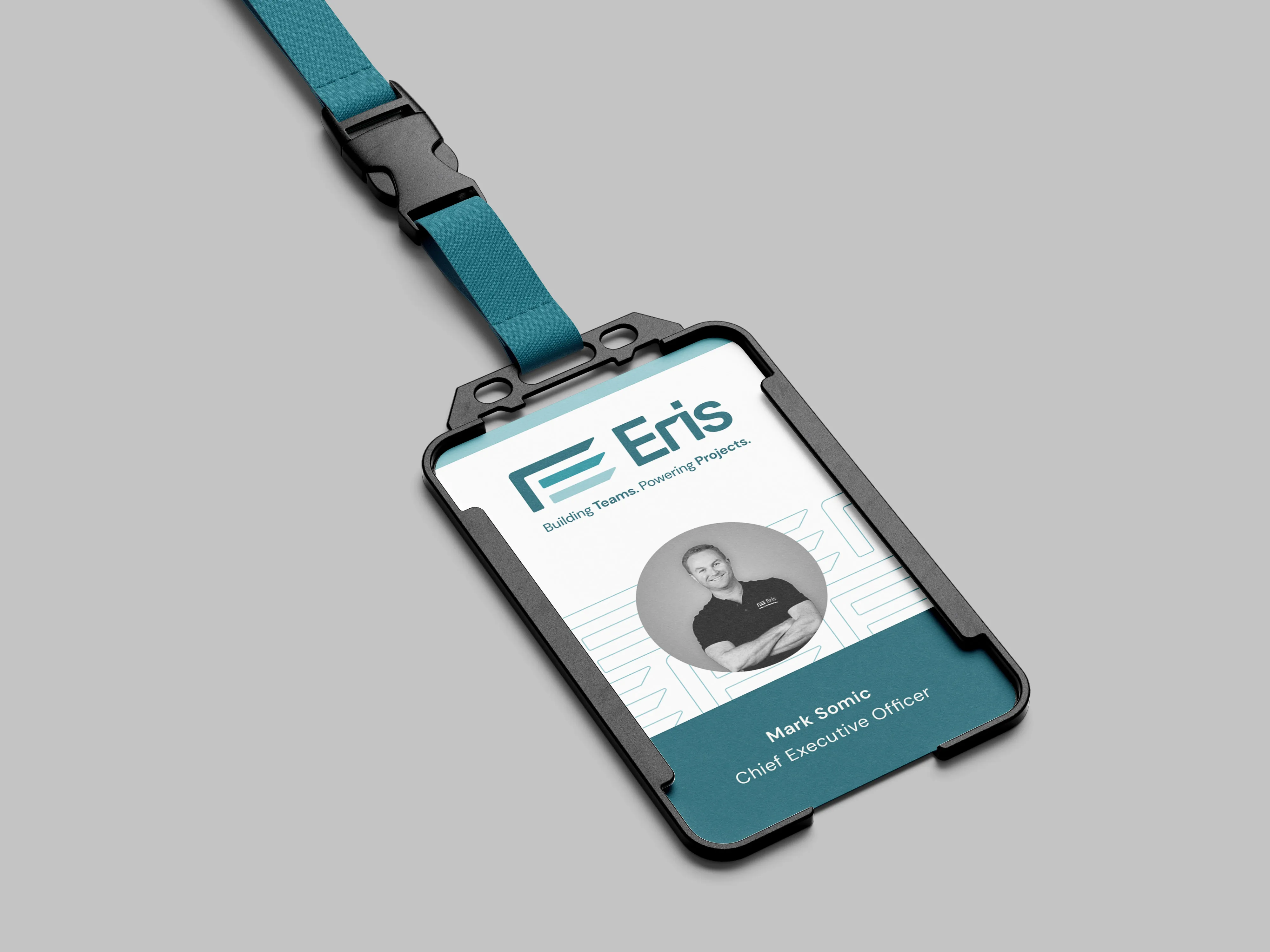
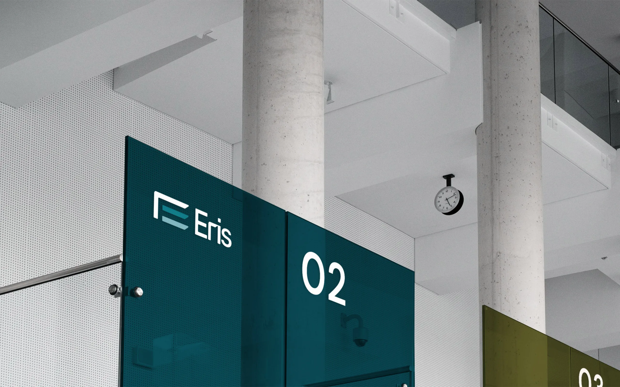
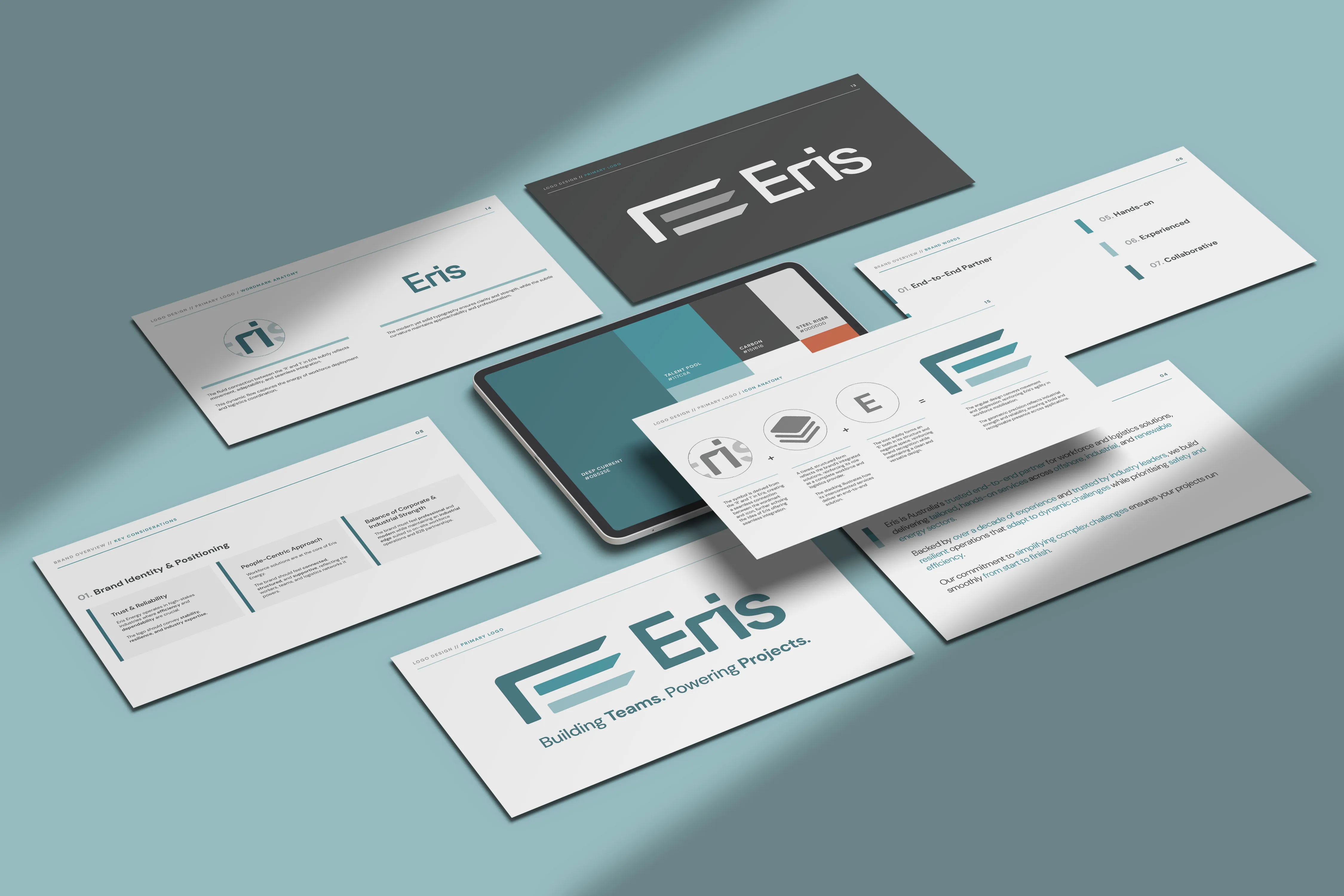
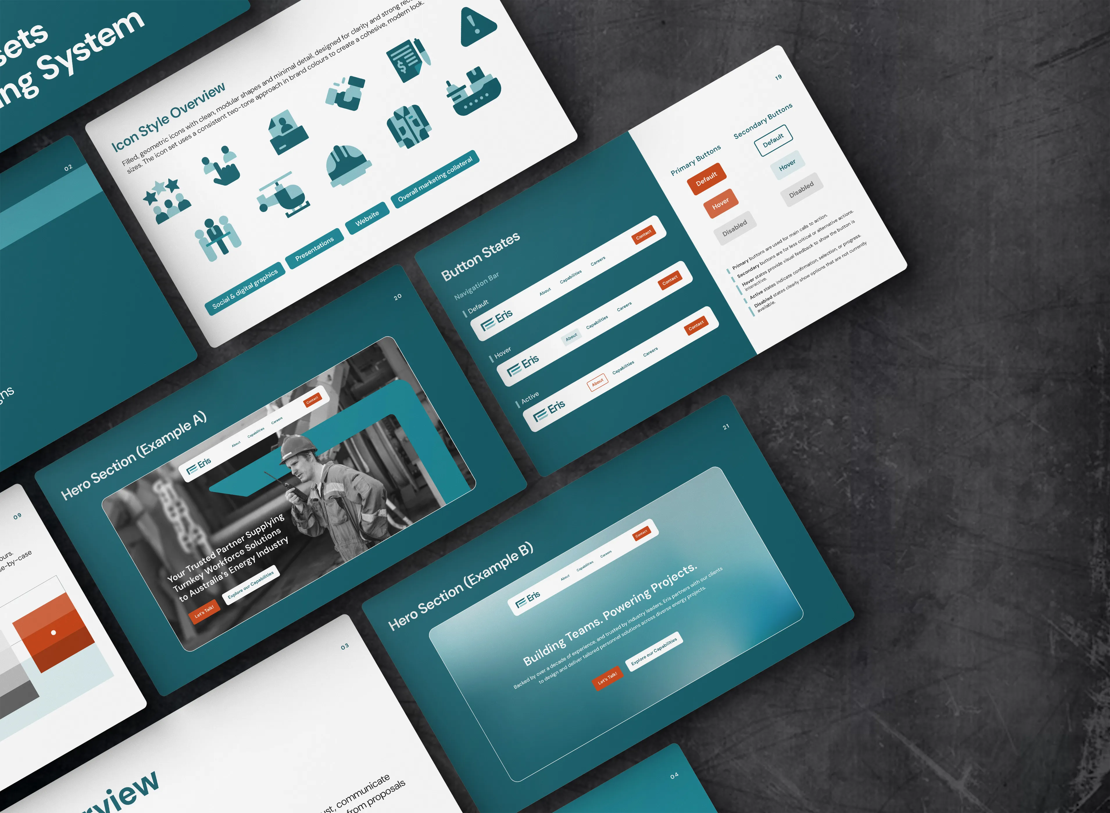
A wordmark and geometric system built for structural clarity, recognisable and credible without leaning on the former parent brand. Typography and colour balanced industrial authority with warmth that kept it from feeling cold or corporate.

Applications Proposals, presentations, internal documents and operational materials built on a modular grid, so the team could produce consistent work across every touchpoint without starting from scratch each time.

Brand Guidelines Practical documentation covering every service area: resourcing, logistics, training, payroll and rope access, so the team could apply the brand independently from day one.
Web Design A site applying the same system to UI and navigation, functioning primarily as a capabilities tool for clients evaluating Eris for the first time.
Visual Identity
A wordmark and geometric system built for structural clarity, recognisable and credible without leaning on the former parent brand. Typography and colour balanced industrial authority with warmth that kept it from feeling cold or corporate.
Applications Proposals, presentations, internal documents and operational materials built on a modular grid, so the team could produce consistent work across every touchpoint without starting from scratch each time.
Brand Guidelines Practical documentation covering every service area: resourcing, logistics, training, payroll and rope access, so the team could apply the brand independently from day one.
Web Design A site applying the same system to UI and navigation, functioning primarily as a capabilities tool for clients evaluating Eris for the first time.
Outcome
Immediate
From day one, Eris could walk into client conversations as a fully-formed independent business, not a brand in transition. The materials matched the professionalism the team had always delivered on the ground.
Long-term
As Eris grows into new sectors, the system grows with them. Proposals, presentations and operational documents stay consistent without needing to rebuild anything.
In practice
The brand does what independence requires: it shows that Eris earned its place.
The credibility is in the work. The brand just makes that legible.


READY TO BEGIN
Let's Build Something Distinctive
You've done the hard part. You know what your brand should feel like.
Let's make it look that way.

READY TO BEGIN
Let's Build Something Distinctive
You've done the hard part. You know what your brand should feel like.
Let's make it look that way.
READY TO BEGIN
Let's Build Something Distinctive
You've done the hard part. You know what your brand should feel like.
Let's make it look that way.