ANDI MRO
ANDI MRO
Year:
Year:
2024
Deliverables:
Deliverables:
Brand Strategy
Brand Strategy
Visual Identity
Industry:
Industry:
Aerospace Maintenance
Location:
Location:
Perth, Australia
Before
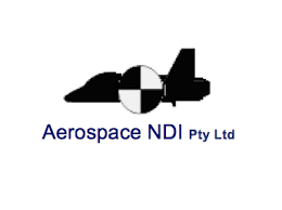
ANDI MRO had been operating as Aerospace NDI for years, building a reputation in Non-Destructive Inspection in the Australian aerospace industry. The business had evolved well beyond that original scope into broader aerospace maintenance, but the name and identity hadn't kept up.
Rebranding to ANDI MRO was the right move. The risk was that a clean break could cost them the recognition they'd spent years building with existing clients.
PROCESS
The brief was less about starting fresh and more about distilling what already existed into something sharper.
The existing identity had equity worth keeping — the challenge was separating what was genuinely recognisable from what was simply familiar because it had been around a long time.
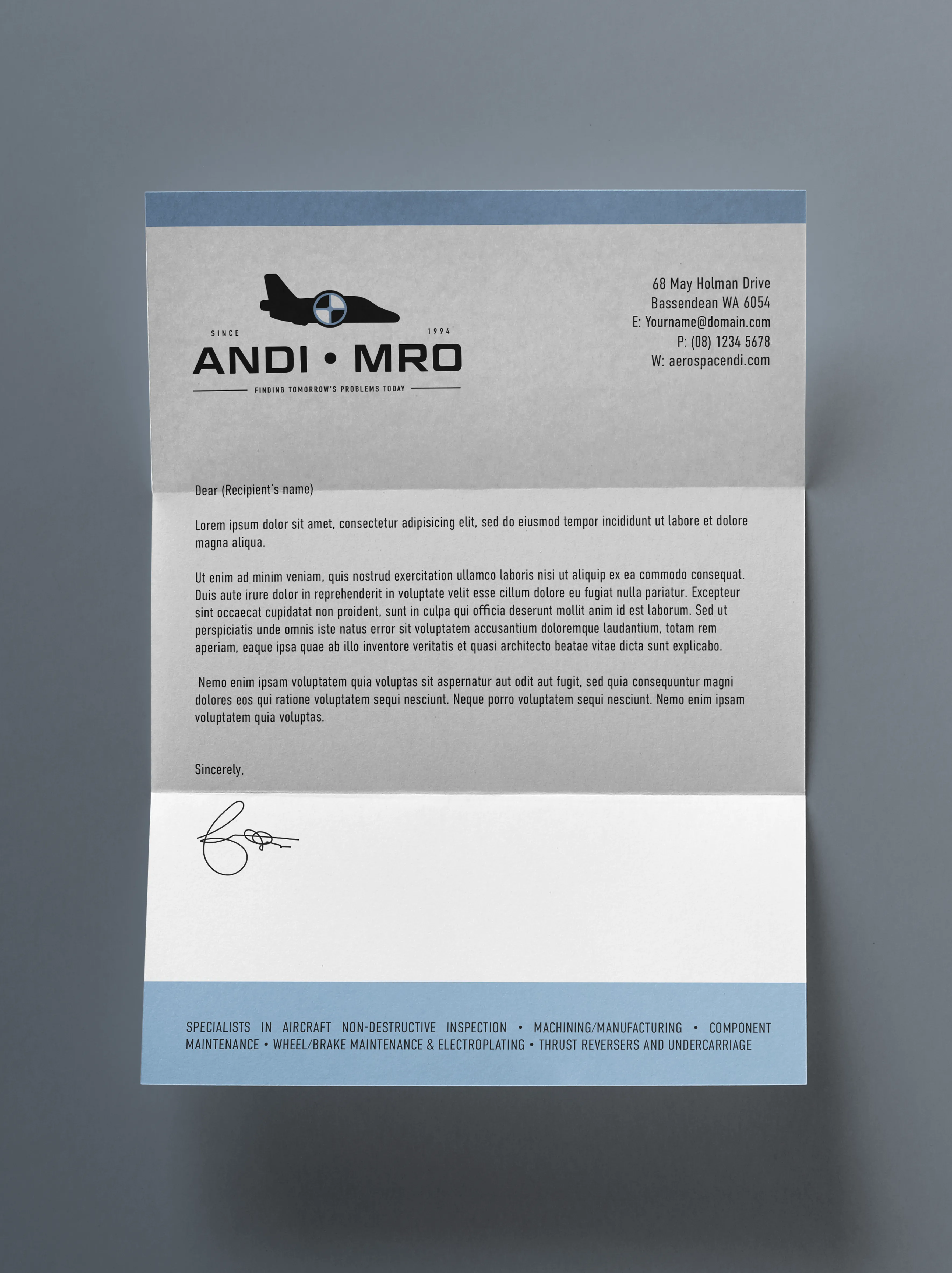
Every decision was approached through the lens of where the brand would actually need to perform: uniforms, signage, vehicle branding, technical documents, small equipment labels, digital interfaces. In aerospace maintenance, the brand has to be legible and unambiguous in environments where clarity is not just a design value, it's a functional one.
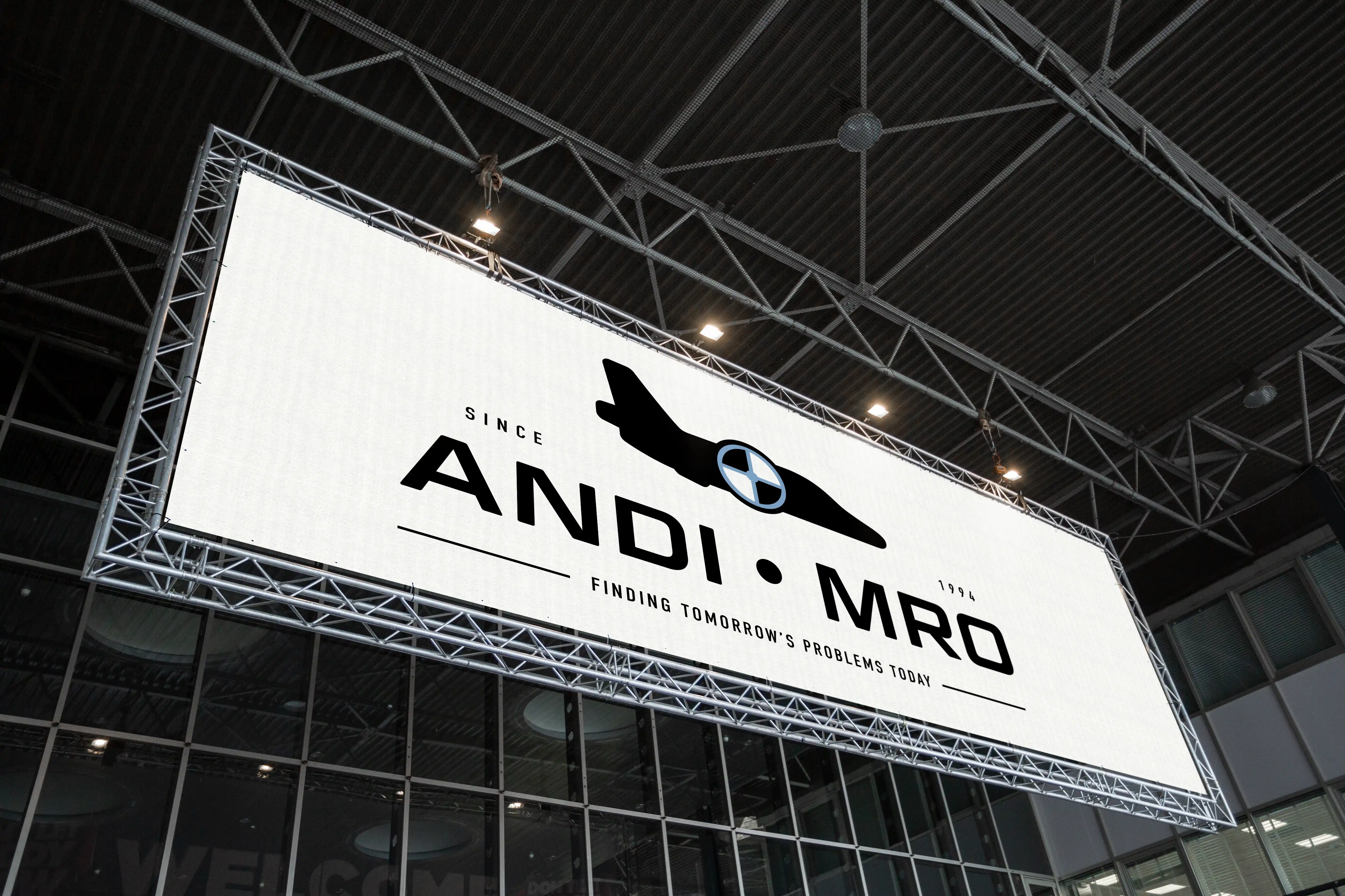
The legacy aircraft symbol was retained and refined into a cleaner, more iconic mark.
The name change was handled so that existing audiences could follow the transition while new audiences encountered a brand that read as established and precise from the start.
The brief was less about starting fresh and more about distilling what already existed into something sharper.
The existing identity had equity worth keeping — the challenge was separating what was genuinely recognisable from what was simply familiar because it had been around a long time.
Every decision was approached through the lens of where the brand would actually need to perform: uniforms, signage, vehicle branding, technical documents, small equipment labels, digital interfaces. In aerospace maintenance, the brand has to be legible and unambiguous in environments where clarity is not just a design value, it's a functional one.
The legacy aircraft symbol was retained and refined into a cleaner, more iconic mark.
The name change was handled so that existing audiences could follow the transition while new audiences encountered a brand that read as established and precise from the start.
The hardest part of a rebrand isn't building something new. It's knowing which parts of the old identity were genuinely recognised, and which were just familiar.
System
Visual Identity
A refined aircraft symbol that preserved continuity with the legacy brand while strengthening recognition in technical contexts. A geometric, highly legible wordmark designed to stay clear at small scales and across varied materials.
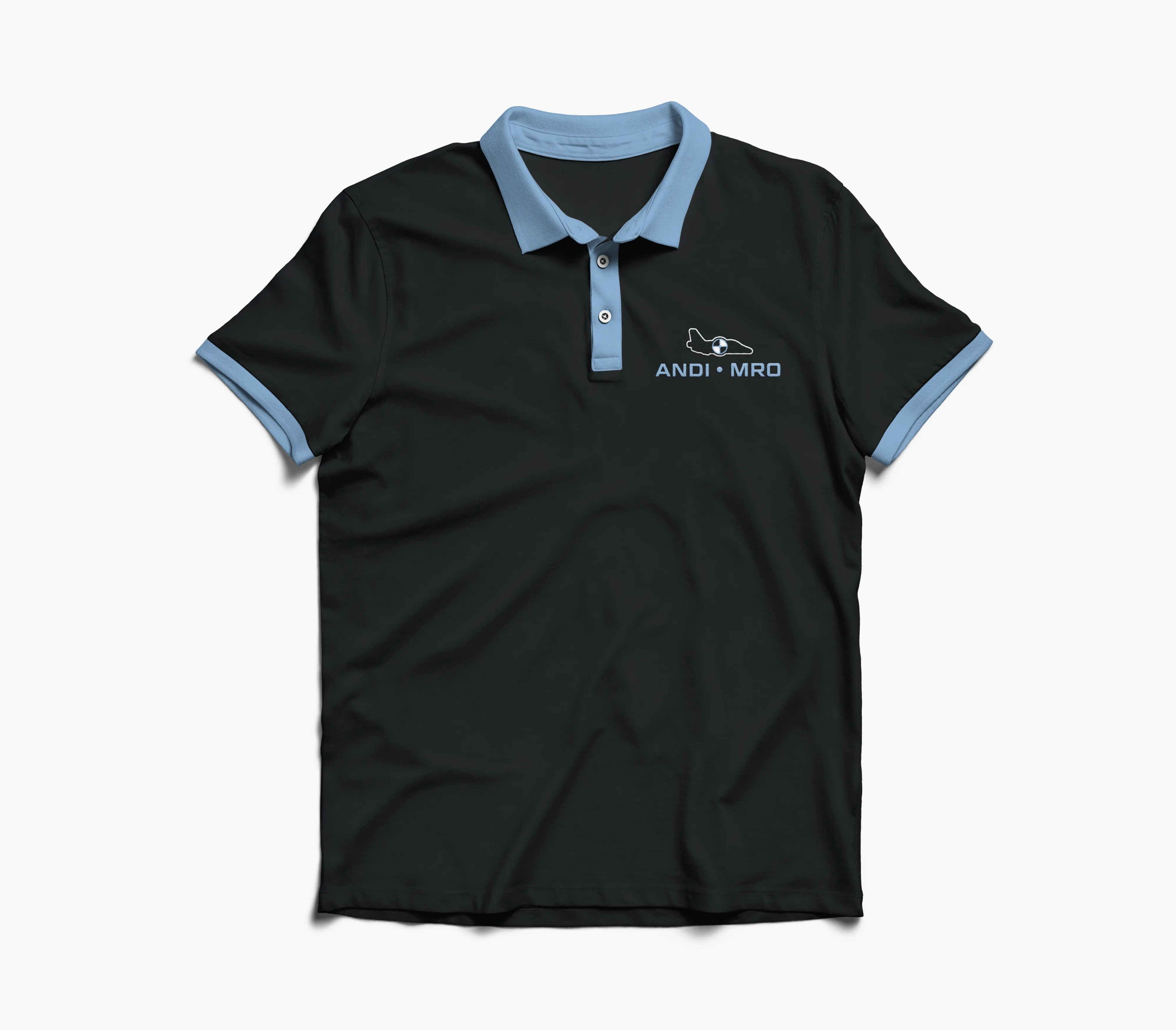
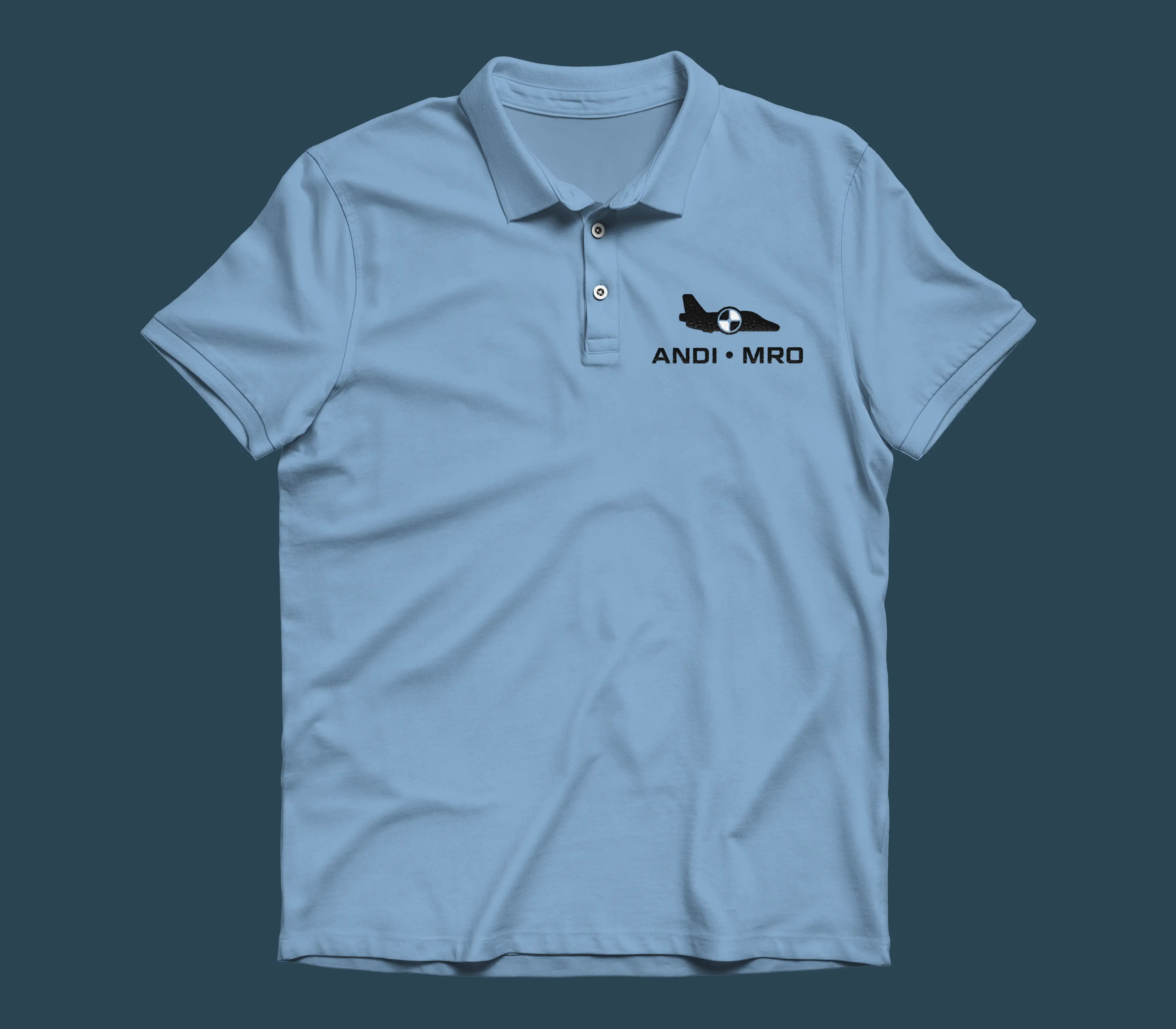
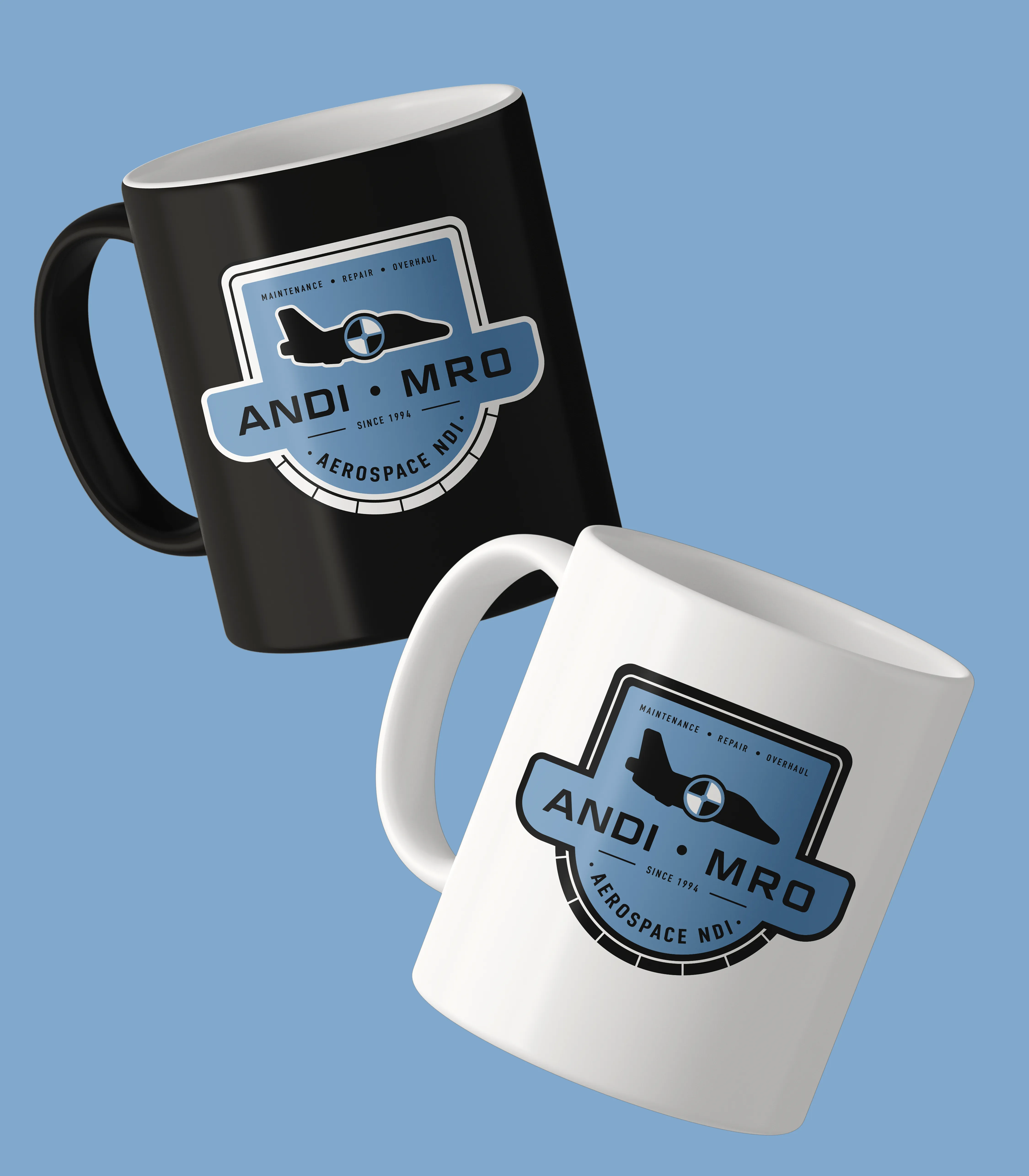
Alongside the primary mark, an emblem logo was developed as a modern counterpart, giving the team an alternative mark for embroidery on uniforms, printed on merchandise, applied to the branded gift mugs the company sends out annually.
Brand System
A high-contrast palette and disciplined typographic hierarchy built for operational environments, from small equipment labels to large hangar signage. Structure and usability were core principles throughout, not afterthoughts.
Applications
Uniforms, stationery, signage, proposals and technical documentation — all applied with consistent visual logic so the brand performs without ambiguity across every touchpoint.
Visual Identity
A refined aircraft symbol that preserved continuity with the legacy brand while strengthening recognition in technical contexts. A geometric, highly legible wordmark designed to stay clear at small scales and across varied materials.
Alongside the primary mark, an emblem logo was developed as a modern counterpart, giving the team an alternative mark for embroidery on uniforms, printed on merchandise, applied to the branded gift mugs the company sends out annually.
Brand System
A high-contrast palette and disciplined typographic hierarchy built for operational environments, from small equipment labels to large hangar signage. Structure and usability were core principles throughout, not afterthoughts.
Applications
Uniforms, stationery, signage, proposals and technical documentation — all applied with consistent visual logic so the brand performs without ambiguity across every touchpoint.
Outcome
Immediate
ANDI MRO could present its new name and identity to existing clients with confidence. The visual continuity meant the rebrand read as evolution rather than replacement — recognition was preserved, not discarded.
Long-term
A scalable system built on engineering logic means the brand extends cleanly into new materials, new contexts and new capabilities as the business grows its presence in aerospace maintenance.
In practice
The identity does what a rebrand in this industry needs to do: it signals that the business has matured without suggesting it has changed what made it trustworthy in the first place.
READY TO BEGIN
Let's Build Something Distinctive
You've done the hard part. You know what your brand should feel like.
Let's make it look that way.

READY TO BEGIN
Let's Build Something Distinctive
You've done the hard part. You know what your brand should feel like.
Let's make it look that way.
READY TO BEGIN
Let's Build Something Distinctive
You've done the hard part. You know what your brand should feel like.
Let's make it look that way.